

Prototype & Wireframes
Rapid Wireframe Sprint for Startup MVP Pitch Deck
Prototype & Wireframes
Responsive Wireframe System for Multi-Device Website Testing
Category:
File format:
Style:
Delivery time:
Revisions:
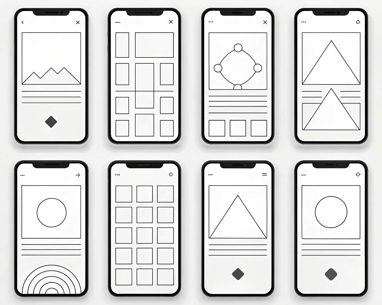
Your website needs to work seamlessly on phones, tablets, and desktops. I design a complete responsive wireframe system that shows how your key page layouts adapt across three standard screen sizes: mobile, tablet, and desktop. This isn’t just three static images; it’s a connected system built with auto-layout and constraints, demonstrating how elements reflow, resize, and rearrange.
You get a single design file containing your core page templates designed at multiple breakpoints. The components are built to be fluid, so you can see how a navigation menu collapses into a hamburger menu on mobile or how a three-column desktop layout stacks into a single column on a phone. The package includes a PDF guide that documents the responsive behavior rules for major components. This system acts as a direct foundation for developers, as the structured source file clearly communicates the intended flexible behavior.
Starting with a responsive wireframe system prevents the common issue of designing a beautiful desktop site that then breaks down on mobile. It ensures responsive behavior is considered from the very beginning, not tacked on as an afterthought. This approach is standard for modern web design and reflects how frameworks like Bootstrap or Tailwind CSS structure layouts. I’ve built these systems for over eighty projects, and they consistently reduce back-and-forth with developers during the build phase.
This service works for businesses that know their audience uses multiple devices. It’s ideal for marketing site redesigns, web app front-ends, or any project where a fluid, device-agnostic experience is a priority. It provides clear guidance for both your design team and your development team on how the design should adapt.
€40.00
€71.00
Prototype & Wireframes

Prototype & Wireframes
Prototype & Wireframes
Prototype & Wireframes
Prototype & Wireframes

Prototype & Wireframes
Prototype & Wireframes

Prototype & Wireframes

Prototype & Wireframes
Prototype & Wireframes
Your website needs to work seamlessly on phones, tablets, and desktops. I design a complete responsive wireframe system that shows how your key page layouts adapt across three standard screen sizes: mobile, tablet, and desktop. This isn’t just three static images; it’s a connected system built with auto-layout and constraints, demonstrating how elements reflow, resize, and rearrange.
You get a single design file containing your core page templates designed at multiple breakpoints. The components are built to be fluid, so you can see how a navigation menu collapses into a hamburger menu on mobile or how a three-column desktop layout stacks into a single column on a phone. The package includes a PDF guide that documents the responsive behavior rules for major components. This system acts as a direct foundation for developers, as the structured source file clearly communicates the intended flexible behavior.
Starting with a responsive wireframe system prevents the common issue of designing a beautiful desktop site that then breaks down on mobile. It ensures responsive behavior is considered from the very beginning, not tacked on as an afterthought. This approach is standard for modern web design and reflects how frameworks like Bootstrap or Tailwind CSS structure layouts. I’ve built these systems for over eighty projects, and they consistently reduce back-and-forth with developers during the build phase.
This service works for businesses that know their audience uses multiple devices. It’s ideal for marketing site redesigns, web app front-ends, or any project where a fluid, device-agnostic experience is a priority. It provides clear guidance for both your design team and your development team on how the design should adapt.