Moody and Desaturated Color Grade for Fashion Editorial Portraits
Category:
Color Grading
File format:
JPG, PSD, TIFF
Style:
Moody
Delivery time:
2 days
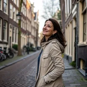
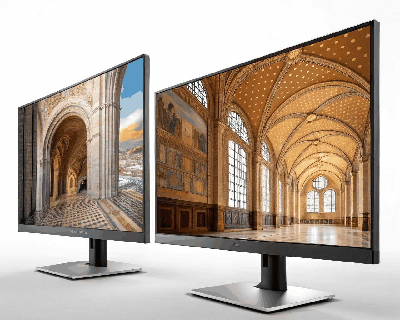
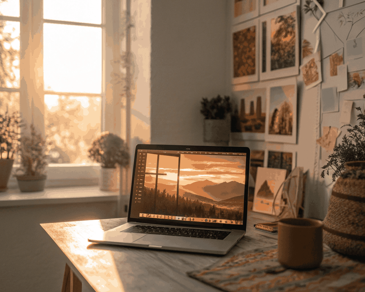
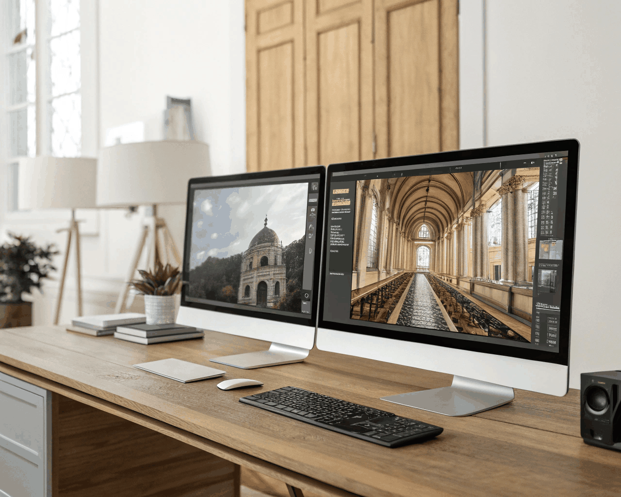
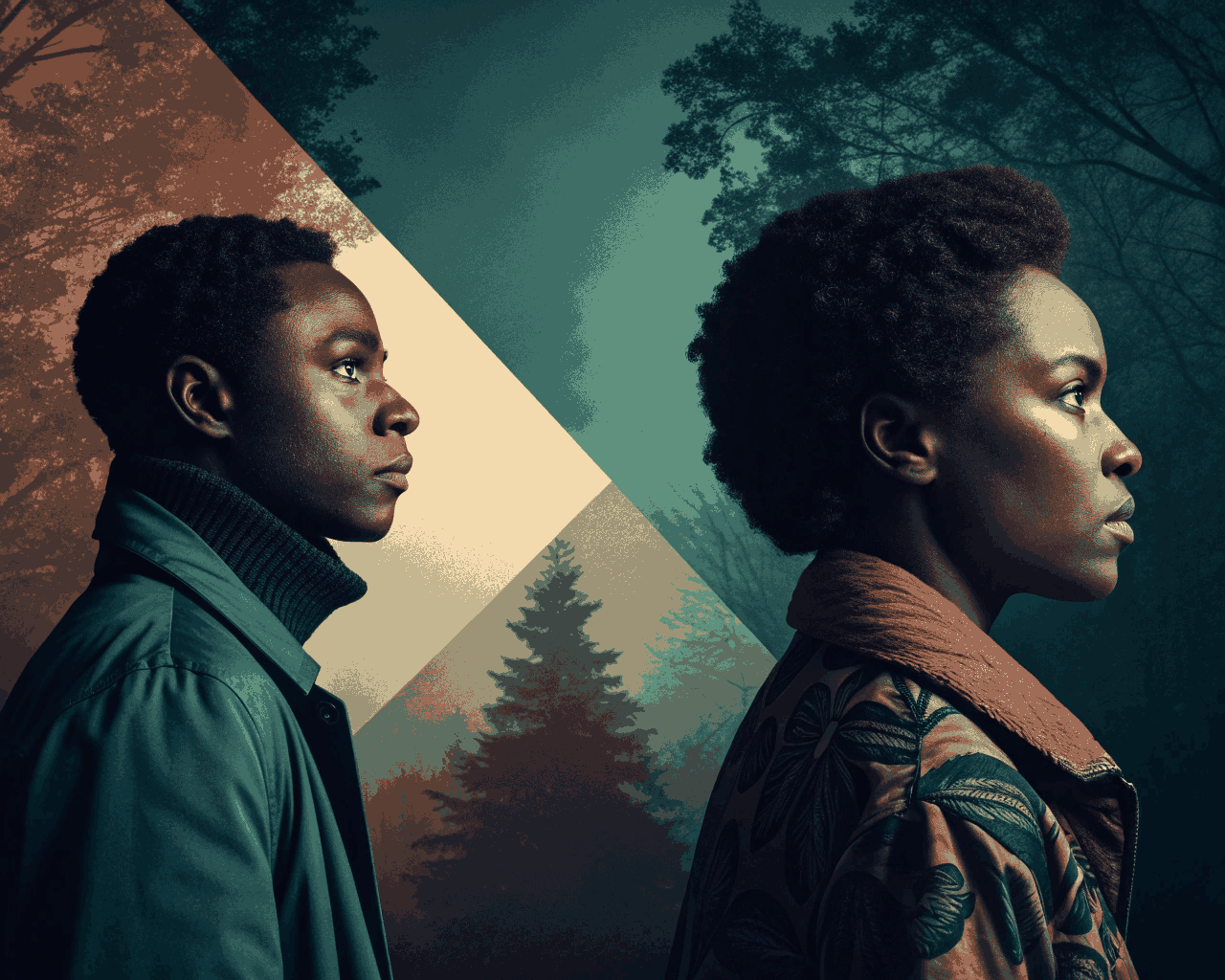
I create a moody, desaturated color grade that brings depth, atmosphere, and editorial intention to fashion and portrait imagery. This style relies on muted tones, elevated contrast, and a subtle signature tint—such as olive green, slate blue, or muted magenta—to craft a distinct emotional narrative rather than a generic filter look.
Working in a layered, professional workflow, I separate the subject from the background to grade them independently. This ensures skin tones stay flattering and luminous while the overall palette remains atmospheric and cohesive. The result is an image that naturally draws attention to the model’s expression, fabric textures, and composition, creating a cinematic, curated feel.
The refinement lies in restraint: I carefully calibrate how much saturation to reduce so the mood feels intentional — never flat or lifeless.
What you receive (per batch of up to 6 images):
* Fully graded high-resolution JPGs for digital use
* Layered PSD files with visible adjustment layers for easy in-house tweaks
* Print-ready TIFF files for professional reproduction
* A 20-minute creative call to align on your desired mood and color direction
* Ongoing collaboration via a shared folder
How we begin:
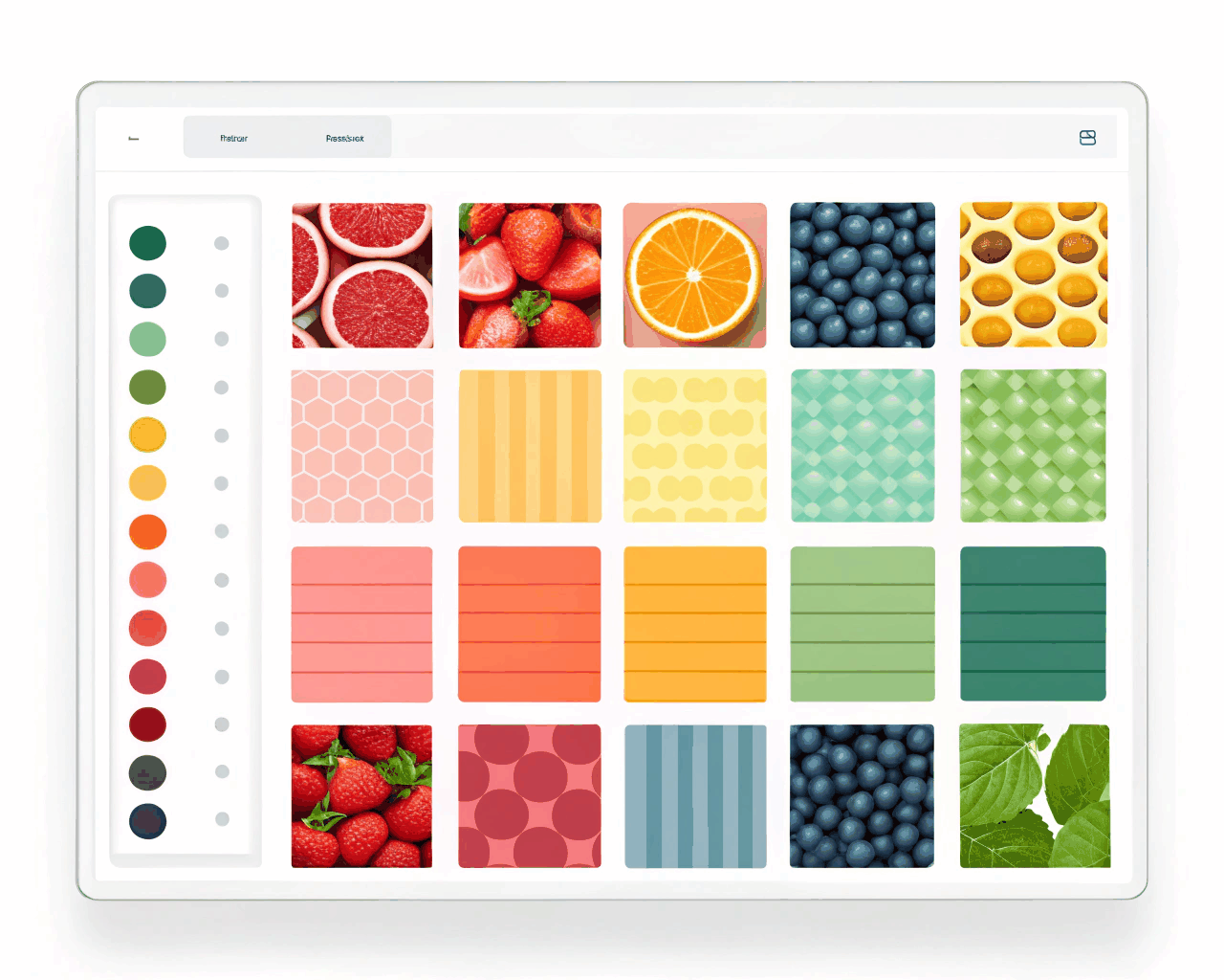
You provide your photos along with reference images that reflect your preferred color tint (e.g., olive green, slate blue, muted magenta, or similar). I translate that vision into a consistent, elevated aesthetic across your set.
This approach is especially powerful for:
– Brands or photographers developing a dark academia aesthetic
– Minimalist fashion lines seeking understated elegance
– Projects aiming for a cinematic, film-inspired visual language
By moving away from bright, oversaturated looks common on social media, this style feels distinctive, curated, and artistically considered — helping your imagery stand out with purpose and depth.
€75.00
€149.00
Comments
Discover the similar products
Color Grading
Vibrant Social Media Color Enhancement for Influencers
Color Grading
I create a moody, desaturated color grade that brings depth, atmosphere, and editorial intention to fashion and portrait imagery. This style relies on muted tones, elevated contrast, and a subtle signature tint—such as olive green, slate blue, or muted magenta—to craft a distinct emotional narrative rather than a generic filter look.
Working in a layered, professional workflow, I separate the subject from the background to grade them independently. This ensures skin tones stay flattering and luminous while the overall palette remains atmospheric and cohesive. The result is an image that naturally draws attention to the model’s expression, fabric textures, and composition, creating a cinematic, curated feel.
The refinement lies in restraint: I carefully calibrate how much saturation to reduce so the mood feels intentional — never flat or lifeless.
What you receive (per batch of up to 6 images):
* Fully graded high-resolution JPGs for digital use
* Layered PSD files with visible adjustment layers for easy in-house tweaks
* Print-ready TIFF files for professional reproduction
* A 20-minute creative call to align on your desired mood and color direction
* Ongoing collaboration via a shared folder
How we begin:
You provide your photos along with reference images that reflect your preferred color tint (e.g., olive green, slate blue, muted magenta, or similar). I translate that vision into a consistent, elevated aesthetic across your set.
This approach is especially powerful for:
– Brands or photographers developing a dark academia aesthetic
– Minimalist fashion lines seeking understated elegance
– Projects aiming for a cinematic, film-inspired visual language
By moving away from bright, oversaturated looks common on social media, this style feels distinctive, curated, and artistically considered — helping your imagery stand out with purpose and depth.