
Design Systems
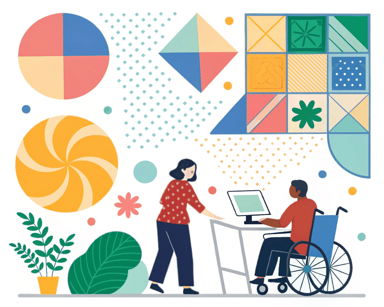
Accessibility-First UI Component Library Audit & Build
Design Systems
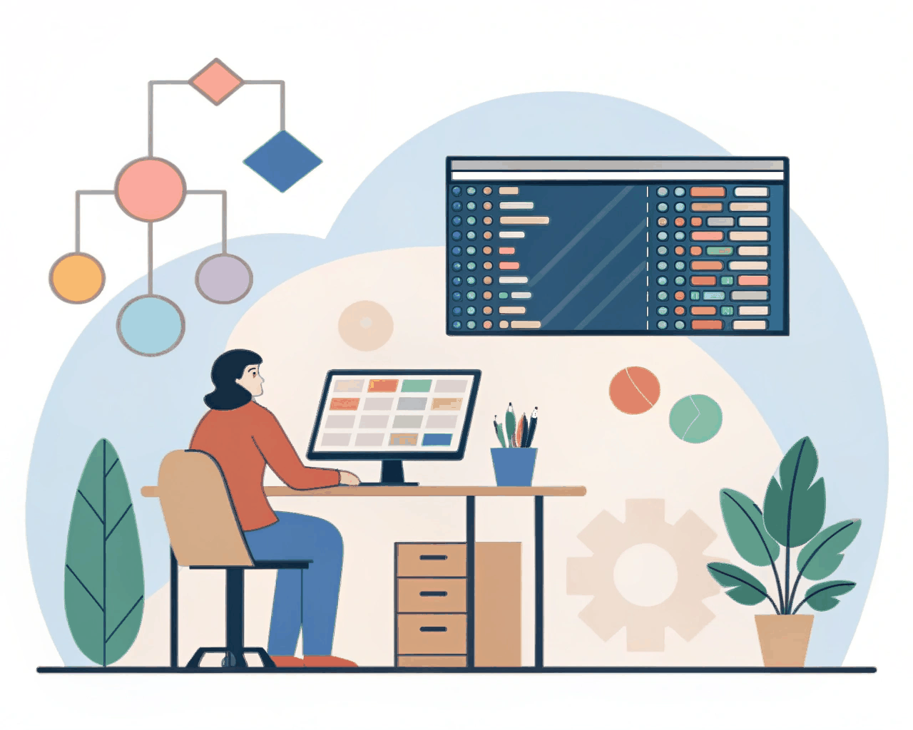
Interactive Prototyping Library with Advanced Figma Component Variants
Category:
File format:
Style:
Delivery time:
Revisions:
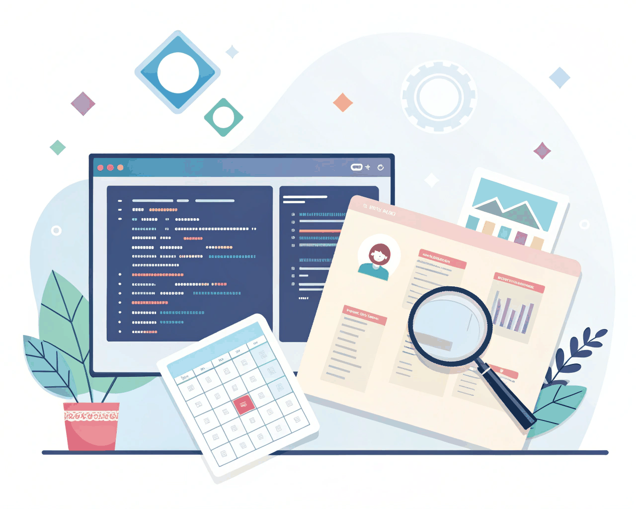
Static component libraries show how something looks, but they often miss how it should behave. I build interactive design libraries with advanced variants and prototyping connections baked in, so your team can prototype complex user flows with real-feeling interactions directly in your design tool.
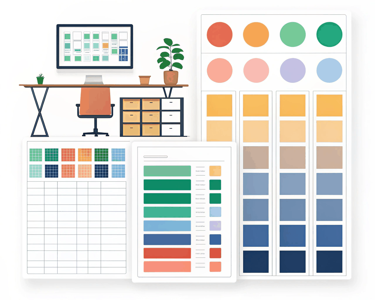
The core deliverable is a master component library filled with smart components.A button isn’t just one symbol; it’s a single component with variants for size (small, medium, large), state (default, hover, pressed, loading, disabled) and hierarchy (primary, secondary, tertiary). These variants use interactive component properties, so designers can switch a button from a ‘large primary loading’ state to a ‘small disabled’ state using the right-side panel without detaching anything. I connect these components with interactive prototypes that demonstrate micro-interactions: a dropdown that opens, a toggle that switches, a modal that slides in with an overlay.
You also receive a short screen-recorded video walkthrough that explains how to use the more advanced features, like nested component instances or interactive state changes triggered by hover. This level of detail in the design phase catches interaction problems early and provides much clearer specifications for developers. They can see not just what a selected tab looks like, but how the selection state moves and what the transition timing should be.
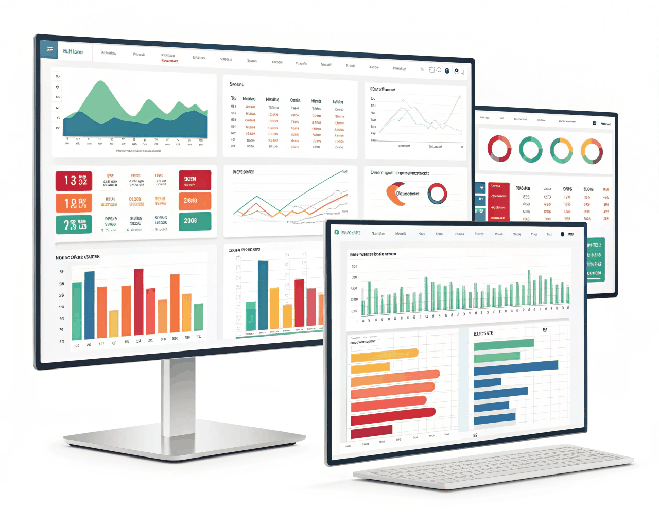
This service is great for product teams working on applications with dense, dynamic interfaces like analytics dashboards, trading platforms or admin panels. It turns your design system from a style guide into a true prototyping toolkit. I structure the files with clear layer naming and auto-layout settings so components resize intelligently. Using this approach, I’ve helped teams cut their prototype creation time in half while making the prototypes themselves more valuable for user testing and stakeholder reviews.
€30.00
Design Systems
Design Systems
Design Systems
Design Systems
Design Systems
Design Systems
Design Systems
Design Systems

Design Systems
Static component libraries show how something looks, but they often miss how it should behave. I build interactive design libraries with advanced variants and prototyping connections baked in, so your team can prototype complex user flows with real-feeling interactions directly in your design tool.
The core deliverable is a master component library filled with smart components.A button isn’t just one symbol; it’s a single component with variants for size (small, medium, large), state (default, hover, pressed, loading, disabled) and hierarchy (primary, secondary, tertiary). These variants use interactive component properties, so designers can switch a button from a ‘large primary loading’ state to a ‘small disabled’ state using the right-side panel without detaching anything. I connect these components with interactive prototypes that demonstrate micro-interactions: a dropdown that opens, a toggle that switches, a modal that slides in with an overlay.
You also receive a short screen-recorded video walkthrough that explains how to use the more advanced features, like nested component instances or interactive state changes triggered by hover. This level of detail in the design phase catches interaction problems early and provides much clearer specifications for developers. They can see not just what a selected tab looks like, but how the selection state moves and what the transition timing should be.
This service is great for product teams working on applications with dense, dynamic interfaces like analytics dashboards, trading platforms or admin panels. It turns your design system from a style guide into a true prototyping toolkit. I structure the files with clear layer naming and auto-layout settings so components resize intelligently. Using this approach, I’ve helped teams cut their prototype creation time in half while making the prototypes themselves more valuable for user testing and stakeholder reviews.