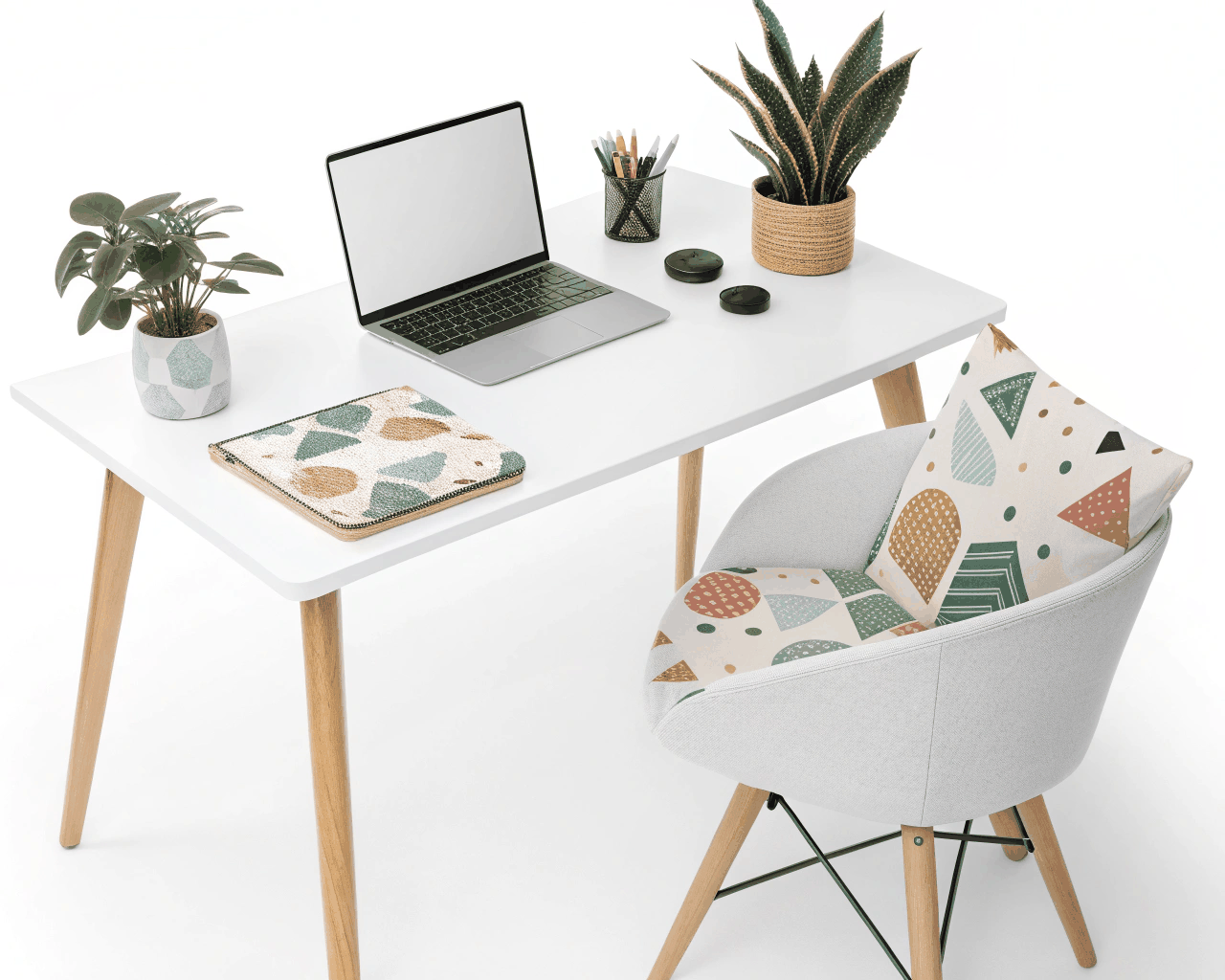
Product Photo Editing
Clean Background Removal & Shadow Creation
Product Photo Editing
Color Consistency & Batch Editing for Product Catalogs
Category:
File format:
Style:
Delivery time:
Revisions:
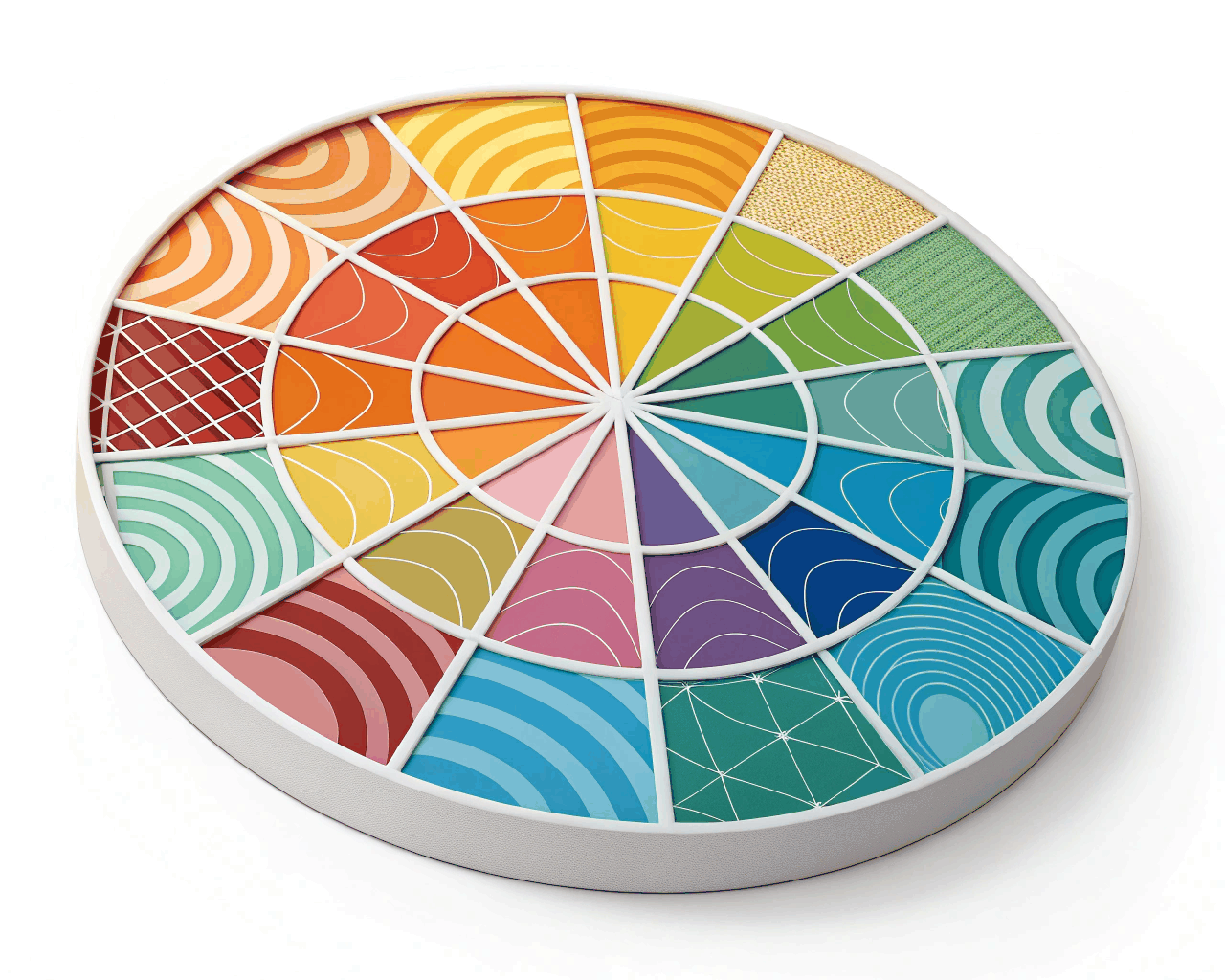
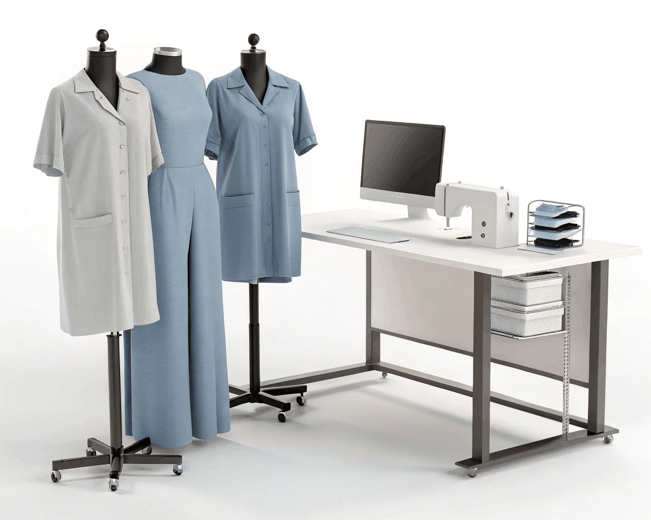
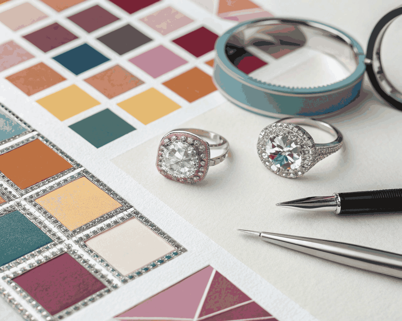
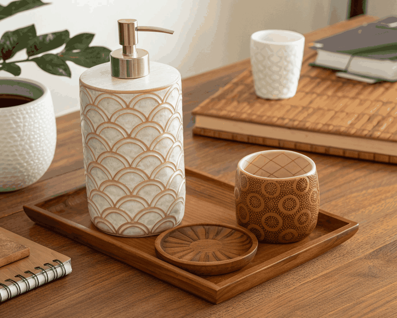
Fifty products shot over three different days, under three different lights, and suddenly your online store looks like a patchwork quilt. One photo is warm yellow, the next is cool blue, and your best-selling item looks washed out next to everything else. I fix that by bringing every image in your catalog to the same visual standard.
The process starts with choosing one reference image—the photo that already looks how you want everything to look. I build a custom color profile from that reference, then systematically apply and fine-tune it across your entire batch. White balance gets neutralized so indoor yellow casts and overcast blue shifts disappear. Exposure levels are standardized so no product appears darker or lighter than its neighbors. I adjust contrast uniformly and perform basic cleanup—removing dust spots and straightening any slightly tilted shots.
Each batch handles up to 50 product photos. Within 14 days, you get a complete set of edited JPGs, organized and ready for upload. The work format is written communication via shared folder. To begin, you provide your photos and specify which image should serve as the master reference.
This isn’t cosmetic—it’s practical. Inconsistent product photos are one of the leading causes of customer returns, because people feel misled when what arrives doesn’t match what they saw. A unified catalog also reduces cognitive load for shoppers, letting them compare products without subconsciously adjusting to different image qualities. I work regularly with jewelry makers, cosmetics brands and craft suppliers where accurate color representation is directly tied to customer trust. It’s also essential for businesses sourcing product photos from multiple manufacturers and needing to present them under one cohesive visual standard.
€200.00
Product Photo Editing
Product Photo Editing
Product Photo Editing
Product Photo Editing
Product Photo Editing
Product Photo Editing
Product Photo Editing
Product Photo Editing

Product Photo Editing
Product Photo Editing
Fifty products shot over three different days, under three different lights, and suddenly your online store looks like a patchwork quilt. One photo is warm yellow, the next is cool blue, and your best-selling item looks washed out next to everything else. I fix that by bringing every image in your catalog to the same visual standard.
The process starts with choosing one reference image—the photo that already looks how you want everything to look. I build a custom color profile from that reference, then systematically apply and fine-tune it across your entire batch. White balance gets neutralized so indoor yellow casts and overcast blue shifts disappear. Exposure levels are standardized so no product appears darker or lighter than its neighbors. I adjust contrast uniformly and perform basic cleanup—removing dust spots and straightening any slightly tilted shots.
Each batch handles up to 50 product photos. Within 14 days, you get a complete set of edited JPGs, organized and ready for upload. The work format is written communication via shared folder. To begin, you provide your photos and specify which image should serve as the master reference.
This isn’t cosmetic—it’s practical. Inconsistent product photos are one of the leading causes of customer returns, because people feel misled when what arrives doesn’t match what they saw. A unified catalog also reduces cognitive load for shoppers, letting them compare products without subconsciously adjusting to different image qualities. I work regularly with jewelry makers, cosmetics brands and craft suppliers where accurate color representation is directly tied to customer trust. It’s also essential for businesses sourcing product photos from multiple manufacturers and needing to present them under one cohesive visual standard.