

Design Systems
Accessibility-First UI Component Library Audit & Build
Design Systems
Brand-Aligned Design Tokens & Style Guide Setup
Category:
File format:
Style:
Delivery time:
Revisions:
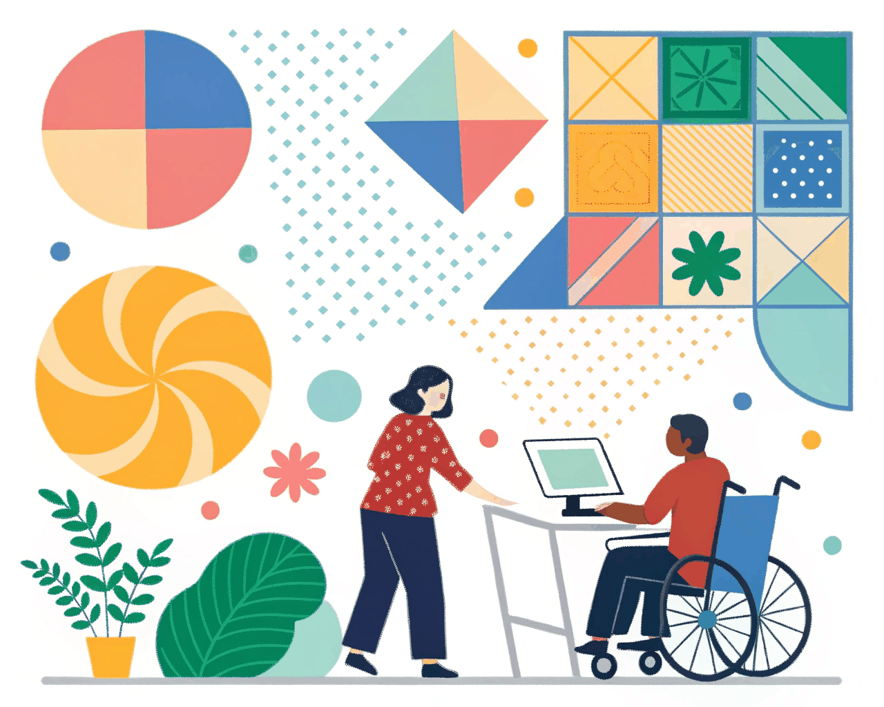
Your brand has colors and a font, but translating that into a functional UI often leads to dozens of similar blues and inconsistent text sizes. I solve that by defining your design tokens—the core variables like colors, spacing and typography—and structuring them into a practical style guide. This is the first, crucial step before building complex components.
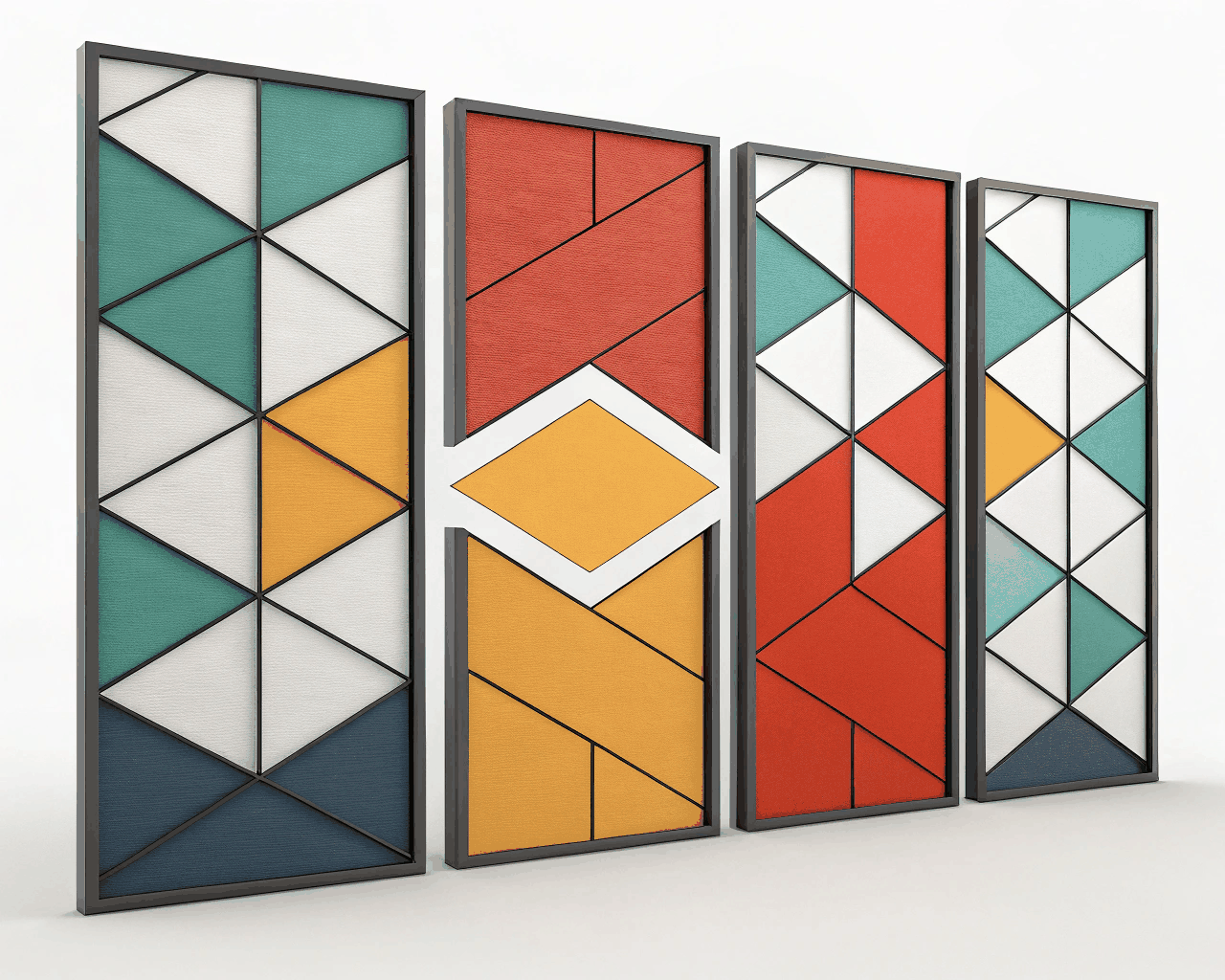
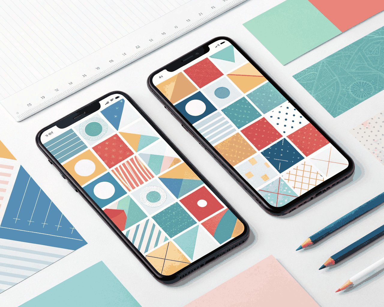
This package provides you with a complete set of design tokens in a ready-to-use JSON format. This includes a primary color palette with ten systematic shades for backgrounds, surfaces and borders, not just one or two brand colors. I define a type scale with clear roles like ‘heading-1’, ‘body-large’ and ‘caption’ with associated line heights and weights. A spacing scale based on multiples like 4px or 8px ensures consistent margins and padding. I then implement these tokens as variables in a shared design file, so your designers can use them instantly. You also receive a clean, one-page style guide PDF that documents the token values and their intended usage.
Having this single source of truth eliminates guesswork. It’s the method used by established design systems—every visual decision traces back to a defined token. This approach typically cuts down initial UI design time significantly because designers aren’t manually picking shades of gray from a color picker.
It’s ideal for marketing teams that have a brand guideline but need to bridge the gap to digital product design, or for startups that are beginning to formalize their UI process. I’ll extract the essential elements from your existing brand assets, then expand and structure them into a system that works for building actual interfaces. The result is a harmonious look across your website, web app and marketing materials, all stemming from the same defined values.
€45.00
Design Systems
Design Systems

Design Systems

Design Systems
Design Systems

Design Systems
Design Systems

Design Systems
Your brand has colors and a font, but translating that into a functional UI often leads to dozens of similar blues and inconsistent text sizes. I solve that by defining your design tokens—the core variables like colors, spacing and typography—and structuring them into a practical style guide. This is the first, crucial step before building complex components.
This package provides you with a complete set of design tokens in a ready-to-use JSON format. This includes a primary color palette with ten systematic shades for backgrounds, surfaces and borders, not just one or two brand colors. I define a type scale with clear roles like ‘heading-1’, ‘body-large’ and ‘caption’ with associated line heights and weights. A spacing scale based on multiples like 4px or 8px ensures consistent margins and padding. I then implement these tokens as variables in a shared design file, so your designers can use them instantly. You also receive a clean, one-page style guide PDF that documents the token values and their intended usage.
Having this single source of truth eliminates guesswork. It’s the method used by established design systems—every visual decision traces back to a defined token. This approach typically cuts down initial UI design time significantly because designers aren’t manually picking shades of gray from a color picker.
It’s ideal for marketing teams that have a brand guideline but need to bridge the gap to digital product design, or for startups that are beginning to formalize their UI process. I’ll extract the essential elements from your existing brand assets, then expand and structure them into a system that works for building actual interfaces. The result is a harmonious look across your website, web app and marketing materials, all stemming from the same defined values.