

Motion Graphics
Abstract Background Loop for Music Visuals and Event Projection
Motion Graphics
Animated Infographic for Annual Reports or Data Presentation
Category:
File format:
Style:
Delivery time:
Revisions:
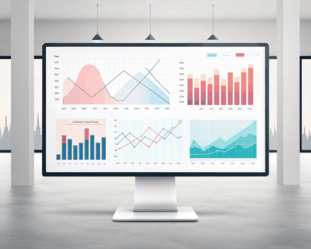
Static charts in a PDF report can be overlooked. An animated infographic brings your annual data, survey results or complex research to life, making trends and comparisons clear and memorable. I specialize in transforming spreadsheets and statistics into a flowing visual narrative. This service is for turning a full dataset into a cohesive 90-second to 2-minute animation. You supply the data and key messages, and I handle the visual storytelling. The package includes a script and storyboard outlining the animation sequence, three style frames for the chart and graphic design approval and two rounds of revisions on the full animation. The infographic style is clean and data-driven, using color coding, smooth graph builds and iconography to illustrate points. The final deliverable is a 4K MP4 file suitable for embedding in websites, playing in shareholder meetings or sharing on LinkedIn, plus the full After Effects project file with all data layers intact for future year updates. This method helps organizations like non-profits or corporate departments communicate their impact more effectively. It follows the principle that animated data is more engaging, similar to the visualizations seen on platforms like Vox or Bloomberg. With a background in both design and data analysis, I focus on accuracy and clarity, ensuring the animation makes the data easier to understand, not just more decorative.
€175.00
Motion Graphics

Motion Graphics
Motion Graphics
Motion Graphics
Motion Graphics
Motion Graphics

Motion Graphics
Motion Graphics

Motion Graphics

Motion Graphics
Static charts in a PDF report can be overlooked. An animated infographic brings your annual data, survey results or complex research to life, making trends and comparisons clear and memorable. I specialize in transforming spreadsheets and statistics into a flowing visual narrative. This service is for turning a full dataset into a cohesive 90-second to 2-minute animation. You supply the data and key messages, and I handle the visual storytelling. The package includes a script and storyboard outlining the animation sequence, three style frames for the chart and graphic design approval and two rounds of revisions on the full animation. The infographic style is clean and data-driven, using color coding, smooth graph builds and iconography to illustrate points. The final deliverable is a 4K MP4 file suitable for embedding in websites, playing in shareholder meetings or sharing on LinkedIn, plus the full After Effects project file with all data layers intact for future year updates. This method helps organizations like non-profits or corporate departments communicate their impact more effectively. It follows the principle that animated data is more engaging, similar to the visualizations seen on platforms like Vox or Bloomberg. With a background in both design and data analysis, I focus on accuracy and clarity, ensuring the animation makes the data easier to understand, not just more decorative.