
Brand Strategy
Modular Logo & Submark Suite for Content Creators
Brand Strategy
Geometric Brand Identity System Service
Category:
File format:
Style:
Delivery time:
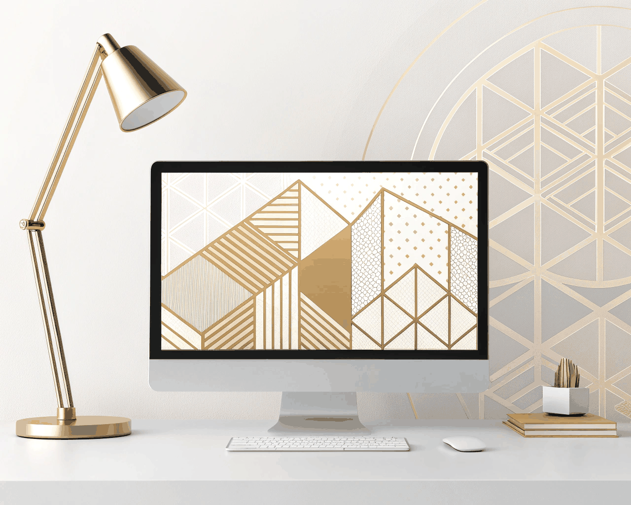
Precision and structure communicate innovation in the tech space. My geometric visual identity systems use clean shapes, balanced ratios and modular components to create a visual language that feels engineered and reliable. This isn’t just a logo but a scalable toolkit for your entire visual presence.
Your package contains a primary geometric logo mark, built from core shapes like circles, squares or triangles. I also design secondary brand patterns and data visualization elements that use the same geometric logic, ensuring everything from your website to your investor deck feels cohesive. You receive three initial concept directions for the core mark. I include up to five rounds of adjustments on your chosen direction to refine the proportions and relationships. Final deliverables are organized into a simple brand guide PDF that shows logo usage, color applications and the geometric grid system, alongside all the standard source files: transparent PNGs, scalable SVGs, editable AI files and print-ready PDFs.
This systematic approach works because it creates inherent consistency. When every icon and graphic element derives from the same geometric rules, your brand feels intentional and unified without much effort. Tech audiences, from B2B SaaS clients to hardware engineers, respond to this clarity. It suggests a product that is well-architected. I’ve built over thirty of these systems for seed to Series A startups, and the feedback always highlights how easy it is for their small teams to apply the assets correctly.
The service suits tech startups, fintech platforms and data analytics firms that need a visual identity capable of growing with them, providing a clear framework for future design work without constant reinvention.
€500.00
Brand Strategy

Brand Strategy

Brand Strategy
Brand Strategy

Brand Strategy

Brand Strategy
Brand Strategy
Brand Strategy
Precision and structure communicate innovation in the tech space. My geometric visual identity systems use clean shapes, balanced ratios and modular components to create a visual language that feels engineered and reliable. This isn’t just a logo but a scalable toolkit for your entire visual presence.
Your package contains a primary geometric logo mark, built from core shapes like circles, squares or triangles. I also design secondary brand patterns and data visualization elements that use the same geometric logic, ensuring everything from your website to your investor deck feels cohesive. You receive three initial concept directions for the core mark. I include up to five rounds of adjustments on your chosen direction to refine the proportions and relationships. Final deliverables are organized into a simple brand guide PDF that shows logo usage, color applications and the geometric grid system, alongside all the standard source files: transparent PNGs, scalable SVGs, editable AI files and print-ready PDFs.
This systematic approach works because it creates inherent consistency. When every icon and graphic element derives from the same geometric rules, your brand feels intentional and unified without much effort. Tech audiences, from B2B SaaS clients to hardware engineers, respond to this clarity. It suggests a product that is well-architected. I’ve built over thirty of these systems for seed to Series A startups, and the feedback always highlights how easy it is for their small teams to apply the assets correctly.
The service suits tech startups, fintech platforms and data analytics firms that need a visual identity capable of growing with them, providing a clear framework for future design work without constant reinvention.