

Design Systems
Design System Audit & Consolidation Plan
Design Systems
Accessibility-First UI Component Library Audit & Build
Category:
File format:
Style:
Delivery time:
Revisions:
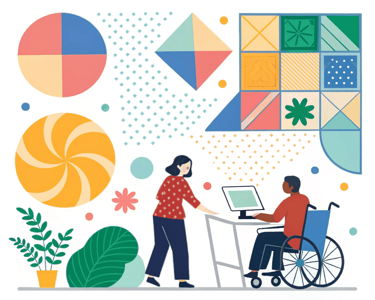
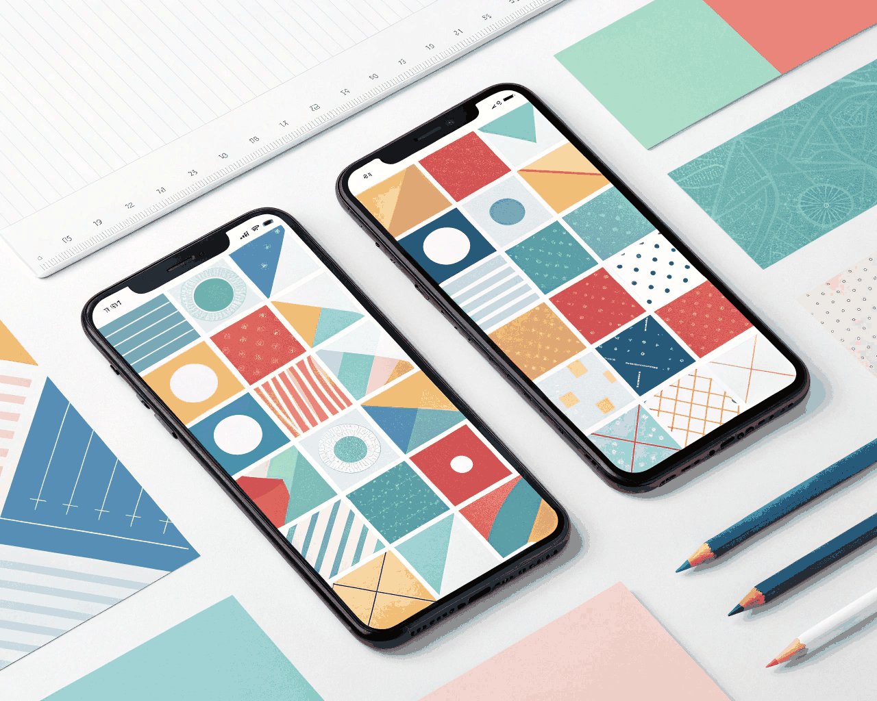
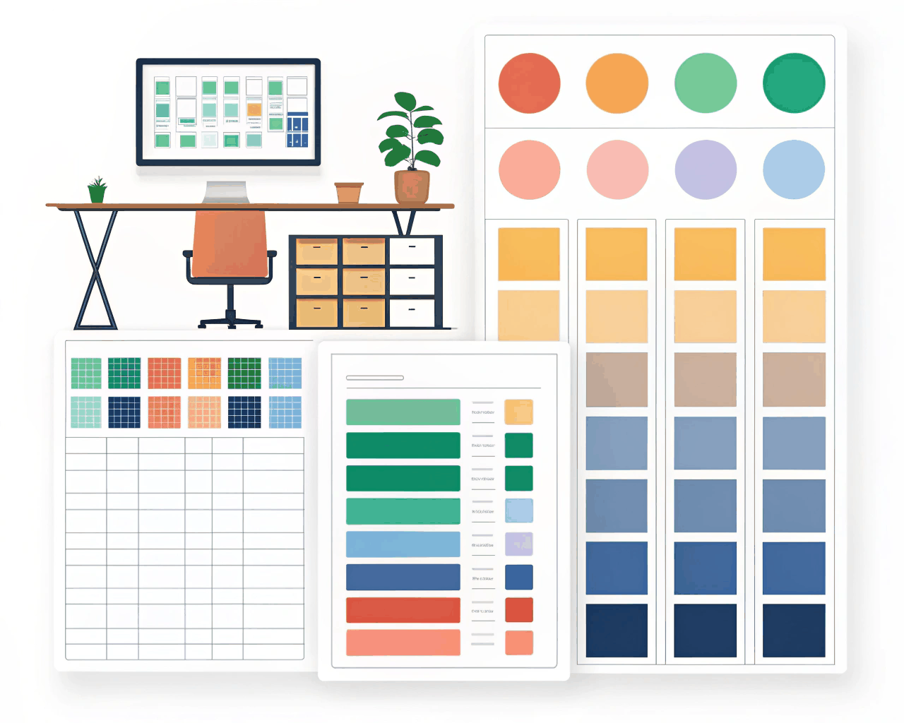
You receive a detailed audit of your current UI components against WCAG 2.1 AA standards, followed by the build-out of an accessible component library.The audit covers color contrast ratios, focus state visibility, interactive element sizing, and semantic structure. I then redesign or refine the problematic components, building a new library where accessibility constraints are baked into the foundations—like a color palette that automatically passes contrast checks and form components with clear error states.
This isn’t just about compliance, it’s about building a system that makes creating accessible interfaces the default path. Each component in the library includes notes in the description panel explaining key accessibility considerations for developers, such as proper ARIA labels or keyboard navigation behavior. I base the work on proven patterns from inclusive design guides like those of the UK Government Digital Service or BBC. Having worked with healthcare and government-adjacent tech where accessibility is non-negotiable, I focus on practical, implementable fixes over theoretical ideals.
The service is ideal for product teams in regulated industries like healthtech, edtech, or fintech, or for any company committed to social impact and inclusive design. It helps you mitigate legal risk while building a better product for more users. We’ll focus on the high-traffic, high-risk areas of your application first, ensuring your most important user flows are robust.
€40.00
€46.00
Design Systems
Design Systems
Design Systems
Design Systems
Design Systems

Design Systems
Design Systems

Design Systems
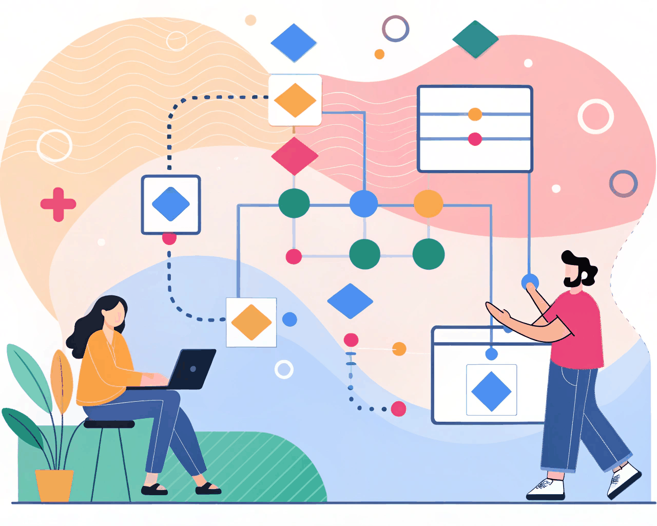
You receive a detailed audit of your current UI components against WCAG 2.1 AA standards, followed by the build-out of an accessible component library.The audit covers color contrast ratios, focus state visibility, interactive element sizing, and semantic structure. I then redesign or refine the problematic components, building a new library where accessibility constraints are baked into the foundations—like a color palette that automatically passes contrast checks and form components with clear error states.
This isn’t just about compliance, it’s about building a system that makes creating accessible interfaces the default path. Each component in the library includes notes in the description panel explaining key accessibility considerations for developers, such as proper ARIA labels or keyboard navigation behavior. I base the work on proven patterns from inclusive design guides like those of the UK Government Digital Service or BBC. Having worked with healthcare and government-adjacent tech where accessibility is non-negotiable, I focus on practical, implementable fixes over theoretical ideals.
The service is ideal for product teams in regulated industries like healthtech, edtech, or fintech, or for any company committed to social impact and inclusive design. It helps you mitigate legal risk while building a better product for more users. We’ll focus on the high-traffic, high-risk areas of your application first, ensuring your most important user flows are robust.