
Webflow / Framer Design
Framer Prototype for Mobile App Onboarding Flow
Webflow / Framer Design
Interactive Framer Prototype for Mobile App Pitch
Category:
File format:
Style:
Delivery time:
Revisions:
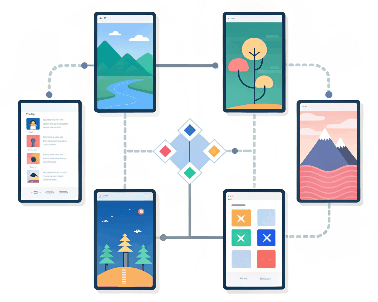
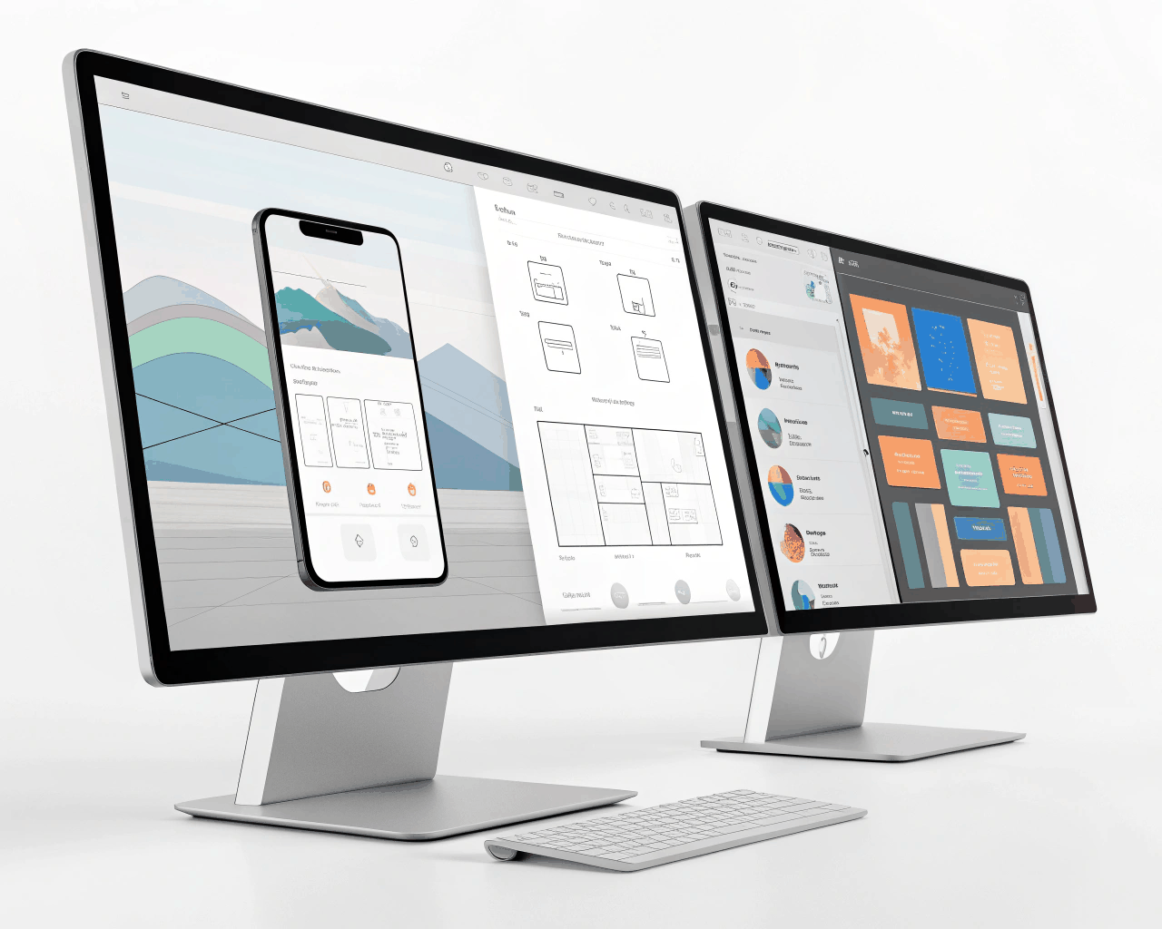
This package includes a clickable, high-fidelity Framer prototype designed to showcase your app’s core user flow for investor meetings or user testing. Instead of static mockups, you get a working simulation that lets stakeholders actually tap through a key sequence, like onboarding or a main feature. I build the prototype in Framer using components and realistic interactions, including transitions between screens, micro-interactions on buttons and toggles that switch states. You receive the complete Framer project file with all layers named and organized, which you can edit directly. The prototype is built with a mobile-first frame and can be viewed on any device via a shareable link. I focus on one primary user journey, typically 5-8 connected screens, to demonstrate functionality with depth rather than breadth. This approach works because it makes your concept tangible. Investors and test users engage more deeply with something they can interact with, which leads to better feedback and clearer understanding. It’s a practical tool I’ve used to help early-stage founders communicate complex ideas quickly, moving the conversation from ‘what if’ to ‘how it works.’
€20.00
Webflow / Framer Design
Webflow / Framer Design
Webflow / Framer Design

Webflow / Framer Design
Webflow / Framer Design
Webflow / Framer Design

Webflow / Framer Design

Webflow / Framer Design
Webflow / Framer Design

Webflow / Framer Design
This package includes a clickable, high-fidelity Framer prototype designed to showcase your app’s core user flow for investor meetings or user testing. Instead of static mockups, you get a working simulation that lets stakeholders actually tap through a key sequence, like onboarding or a main feature. I build the prototype in Framer using components and realistic interactions, including transitions between screens, micro-interactions on buttons and toggles that switch states. You receive the complete Framer project file with all layers named and organized, which you can edit directly. The prototype is built with a mobile-first frame and can be viewed on any device via a shareable link. I focus on one primary user journey, typically 5-8 connected screens, to demonstrate functionality with depth rather than breadth. This approach works because it makes your concept tangible. Investors and test users engage more deeply with something they can interact with, which leads to better feedback and clearer understanding. It’s a practical tool I’ve used to help early-stage founders communicate complex ideas quickly, moving the conversation from ‘what if’ to ‘how it works.’