
Icons & UI Kits
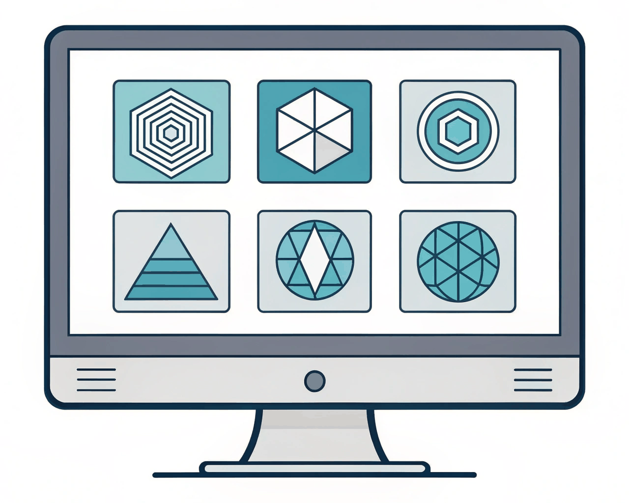
Minimalist App Icon Set for Fintech and Productivity Tools
Icons & UI Kits
Neomorphic Component Library with Interactive States for Dashboards
Category:
File format:
Style:
Delivery time:
Revisions:
I design complete neomorphic UI components that are ready for implementation, not just static visuals. This library focuses on the interactive elements of a modern web dashboard: sliders, toggle switches, progress bars, card widgets and data input fields. The neomorphic style, with its soft shadows and recessed effects, creates a tactile interface that feels modern and engaging. You get a fully organized component library with auto-layout components and variants for every state—default, hover, focused, active and disabled. I also export a matching Adobe XD library and provide clean React component code (JSX with CSS-in-JS) for the core interactive elements, so developers can integrate the look and feel directly. The kit includes a cohesive color system with accessible contrast ratios and a defined elevation system using shadow layers to maintain consistency. After building over a dozen admin panels, I know that a component library must account for real interaction. A toggle switch needs a clear on and off state, a slider needs a draggable handle with feedback. This system is great for web applications, analytics platforms or any product where users spend extended time in a dashboard and benefit from a distinct, soft aesthetic. It offers a designed alternative to the flat Material Design or stark Ant Design systems.
€440.00
Icons & UI Kits
Icons & UI Kits
Icons & UI Kits

Icons & UI Kits
Icons & UI Kits
Icons & UI Kits
Icons & UI Kits
Icons & UI Kits
Icons & UI Kits
I design complete neomorphic UI components that are ready for implementation, not just static visuals. This library focuses on the interactive elements of a modern web dashboard: sliders, toggle switches, progress bars, card widgets and data input fields. The neomorphic style, with its soft shadows and recessed effects, creates a tactile interface that feels modern and engaging. You get a fully organized component library with auto-layout components and variants for every state—default, hover, focused, active and disabled. I also export a matching Adobe XD library and provide clean React component code (JSX with CSS-in-JS) for the core interactive elements, so developers can integrate the look and feel directly. The kit includes a cohesive color system with accessible contrast ratios and a defined elevation system using shadow layers to maintain consistency. After building over a dozen admin panels, I know that a component library must account for real interaction. A toggle switch needs a clear on and off state, a slider needs a draggable handle with feedback. This system is great for web applications, analytics platforms or any product where users spend extended time in a dashboard and benefit from a distinct, soft aesthetic. It offers a designed alternative to the flat Material Design or stark Ant Design systems.