
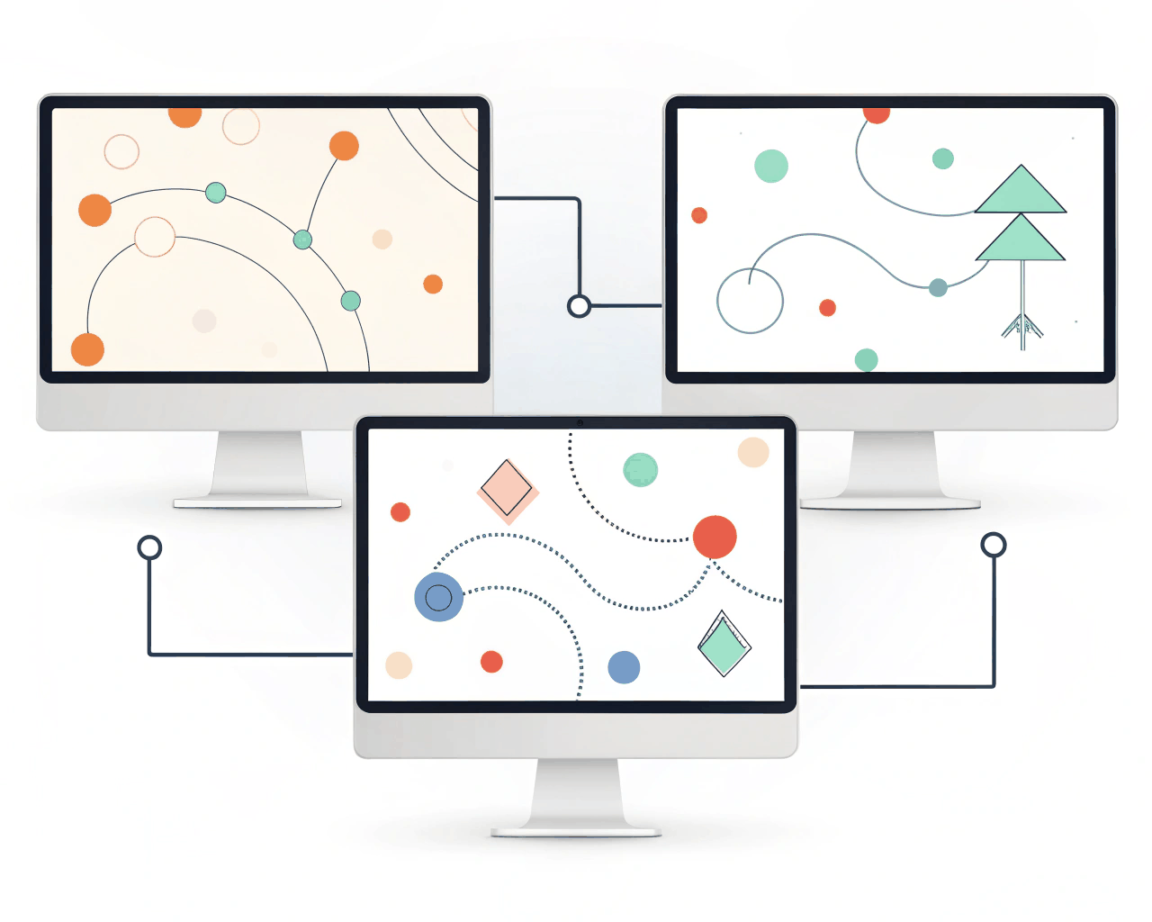
Prototype & Wireframes
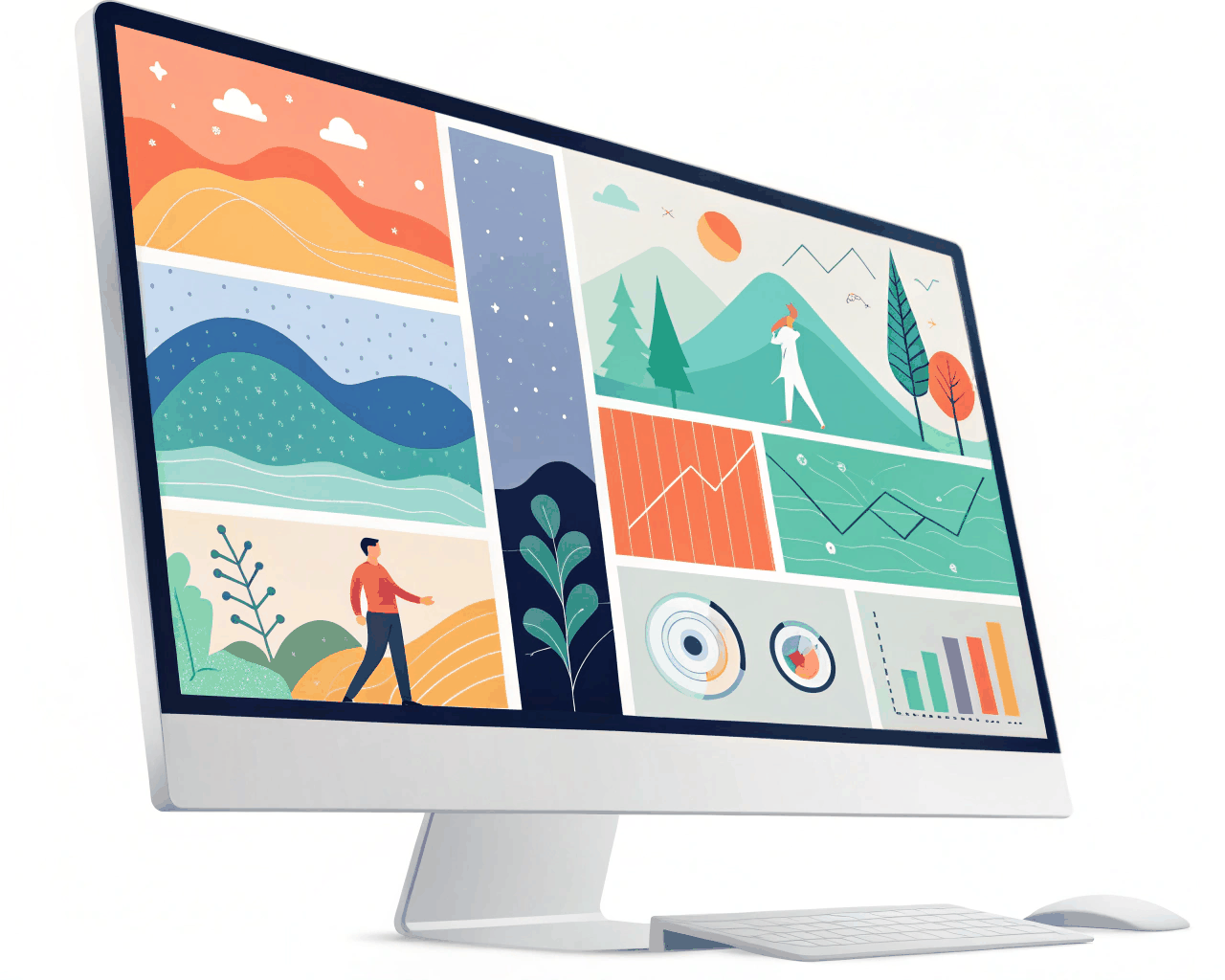
Rapid Wireframe Sprint for Startup MVP Pitch Deck
Prototype & Wireframes
Low-Fidelity Wireframe Kit for Mobile App Concept Development
Category:
File format:
Style:
Delivery time:
Revisions:
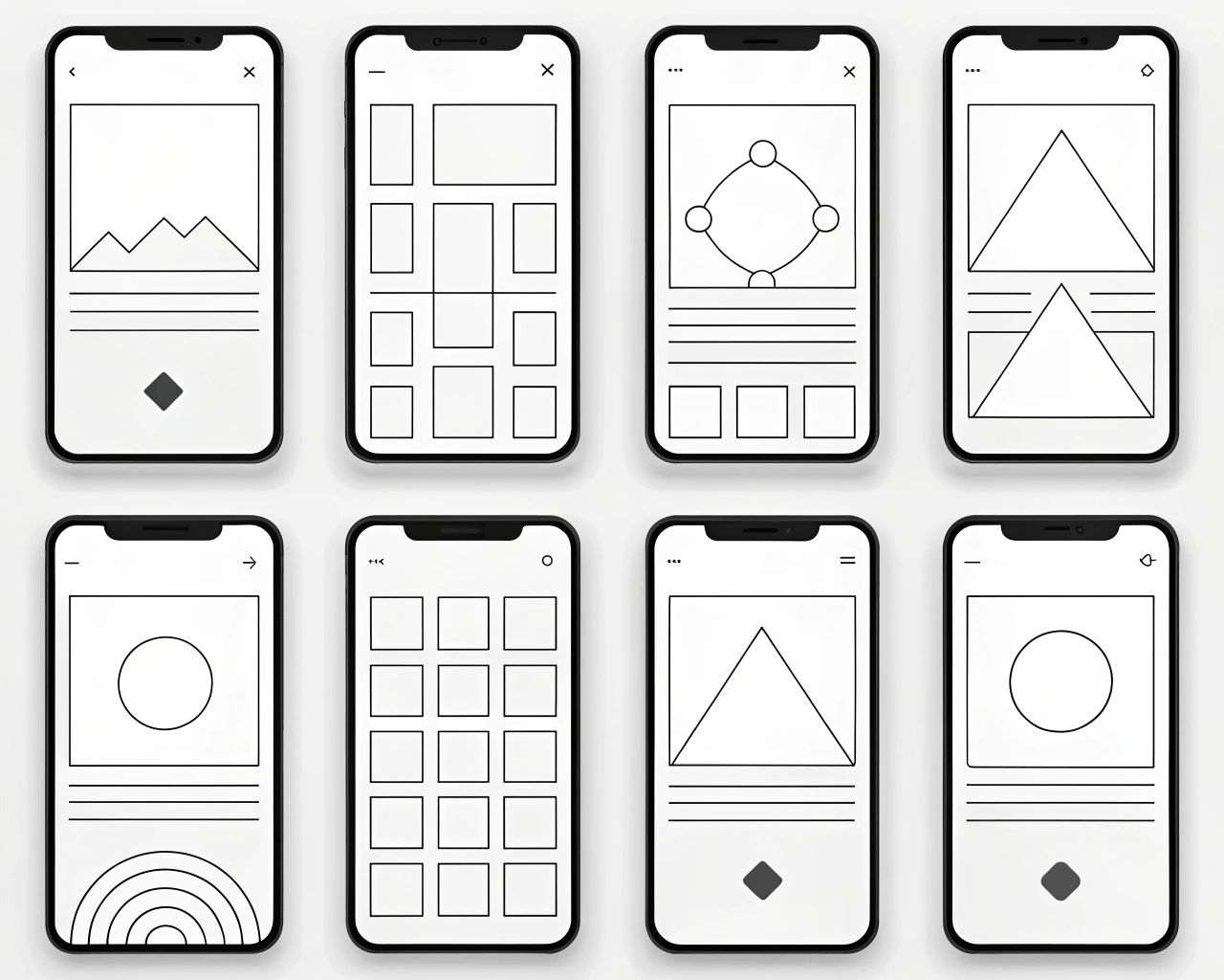
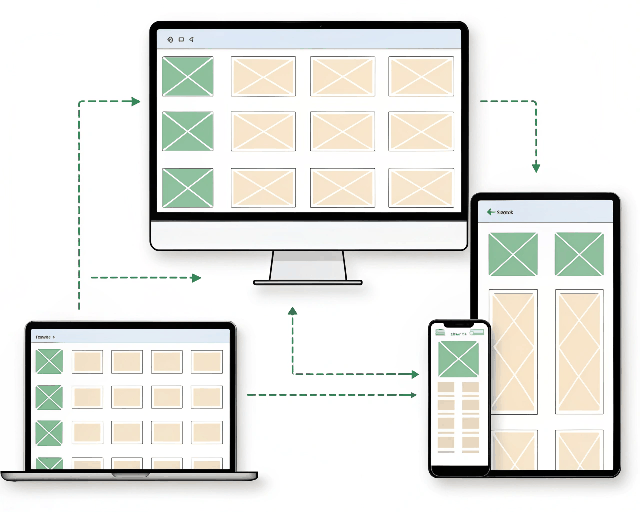
This package includes a complete set of low-fidelity wireframes for your mobile app, focusing purely on structure and flow without visual design distractions. We’ll map out every key screen and user journey, from the initial launch to the primary task completion, using simple gray-scale components and placeholder text. The goal is to establish a solid architectural foundation before any pixel-perfect design begins.
You get a comprehensive wireframe set containing all core app screens, typically between 15 to 25 unique frames depending on complexity. The file is organized into clear user flow sections, like ‘Onboarding’, ‘Main Dashboard’, and ‘User Profile’. I also build a reusable component library within the file for buttons, form fields and navigation bars, so your team can easily extend the wireframes later. A separate PDF document outlines the user flow logic and annotates any specific interaction notes for your developers.
Starting with low-fidelity wireframes speeds up decision-making. Teams debate layout and functionality more freely when they’re not distracted by colors or fonts. My approach is influenced by the structural clarity seen in products like Google Maps or Spotify, where the user’s path through the app is logical and uncluttered. With eight years in UX, I’ve found that this stage is where the most critical usability problems are solved. It forces a focus on hierarchy and task completion, which directly translates to a better final product.
This kit is designed for app founders, developers and product teams who are in the early conceptual phase. It works well for both completely new ideas and for adding major new features to existing applications.
€80.00
Prototype & Wireframes

Prototype & Wireframes
Prototype & Wireframes
Prototype & Wireframes

Prototype & Wireframes
Prototype & Wireframes

Prototype & Wireframes
Prototype & Wireframes
Prototype & Wireframes
Prototype & Wireframes
This package includes a complete set of low-fidelity wireframes for your mobile app, focusing purely on structure and flow without visual design distractions. We’ll map out every key screen and user journey, from the initial launch to the primary task completion, using simple gray-scale components and placeholder text. The goal is to establish a solid architectural foundation before any pixel-perfect design begins.
You get a comprehensive wireframe set containing all core app screens, typically between 15 to 25 unique frames depending on complexity. The file is organized into clear user flow sections, like ‘Onboarding’, ‘Main Dashboard’, and ‘User Profile’. I also build a reusable component library within the file for buttons, form fields and navigation bars, so your team can easily extend the wireframes later. A separate PDF document outlines the user flow logic and annotates any specific interaction notes for your developers.
Starting with low-fidelity wireframes speeds up decision-making. Teams debate layout and functionality more freely when they’re not distracted by colors or fonts. My approach is influenced by the structural clarity seen in products like Google Maps or Spotify, where the user’s path through the app is logical and uncluttered. With eight years in UX, I’ve found that this stage is where the most critical usability problems are solved. It forces a focus on hierarchy and task completion, which directly translates to a better final product.
This kit is designed for app founders, developers and product teams who are in the early conceptual phase. It works well for both completely new ideas and for adding major new features to existing applications.