

Animated Infographic for Annual Reports and Data Presentations
Category:
2D Animation
File format:
GIF, JSON for Web, MP4, PowerPoint-ready video
Style:
Motion Graphics
Delivery time:
3–5 days
Revisions:
2
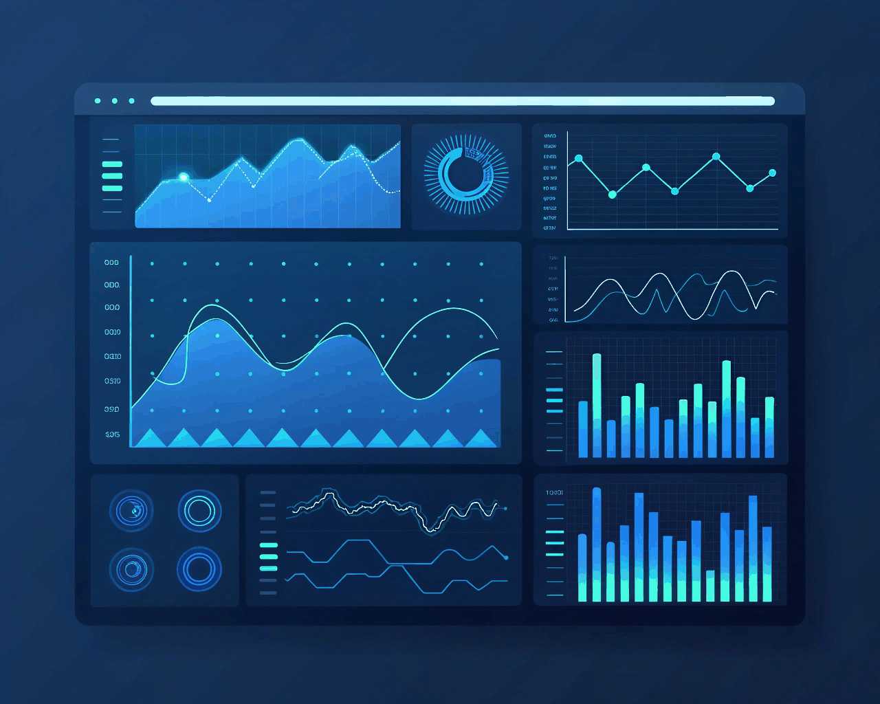
Static charts in a PDF report are easy to skip. An animated infographic directs attention to key data points, making your annual results or research findings more engaging for stakeholders and press. I take your spreadsheet data and design a cohesive motion graphic that reveals statistics in a logical, compelling sequence. The package delivers a complete ninety-second animation. You also receive five standalone animated chart segments as GIFs for use in social media teasers, a version formatted for embedding in PowerPoint or Google Slides that plays on a loop and a data-driven JSON file that can be integrated into an interactive web element by a developer. Animation allows you to tell a story with numbers. You can compare growth year-over-year, highlight a peak performance metric or show a process flow. I use color and motion intentionally to guide the viewer’s understanding, not just for decoration. This method works for non-profit organizations showcasing impact, corporate communications teams and market research firms presenting insights. It transforms dense information into a clear visual narrative that people are more likely to watch and remember.
€40.00
Comments
Discover the similar products


2D Animation
Character Animation Reel for Indie Game Developers
2D Animation


2D Animation
Animated Lyrics Video for Music Artists and Bands
2D Animation
Static charts in a PDF report are easy to skip. An animated infographic directs attention to key data points, making your annual results or research findings more engaging for stakeholders and press. I take your spreadsheet data and design a cohesive motion graphic that reveals statistics in a logical, compelling sequence. The package delivers a complete ninety-second animation. You also receive five standalone animated chart segments as GIFs for use in social media teasers, a version formatted for embedding in PowerPoint or Google Slides that plays on a loop and a data-driven JSON file that can be integrated into an interactive web element by a developer. Animation allows you to tell a story with numbers. You can compare growth year-over-year, highlight a peak performance metric or show a process flow. I use color and motion intentionally to guide the viewer’s understanding, not just for decoration. This method works for non-profit organizations showcasing impact, corporate communications teams and market research firms presenting insights. It transforms dense information into a clear visual narrative that people are more likely to watch and remember.