

AI Video Generation
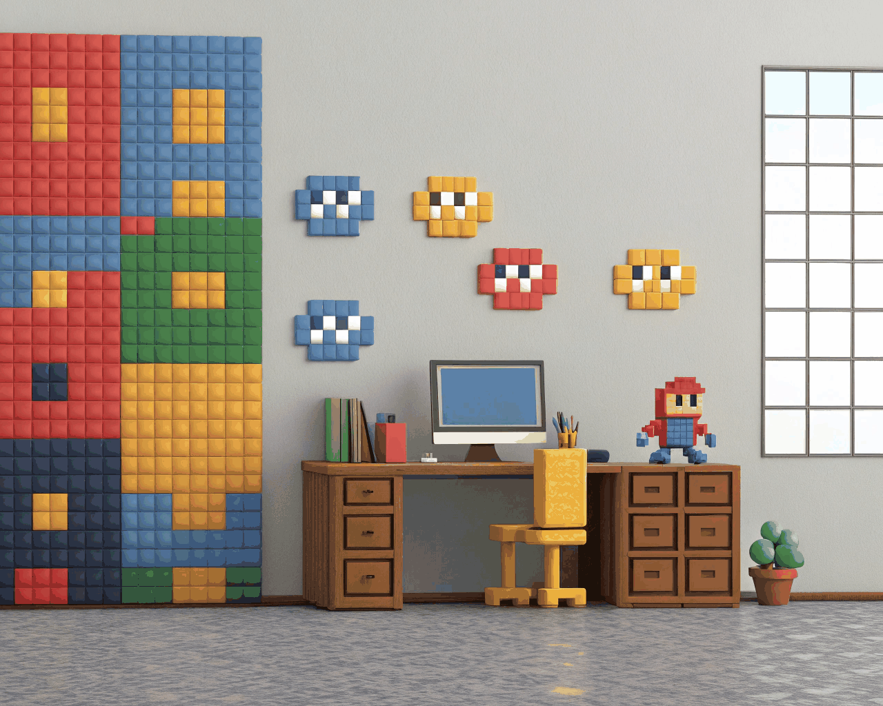
Animated Explainer Video for SaaS Product Launches
AI Video Generation
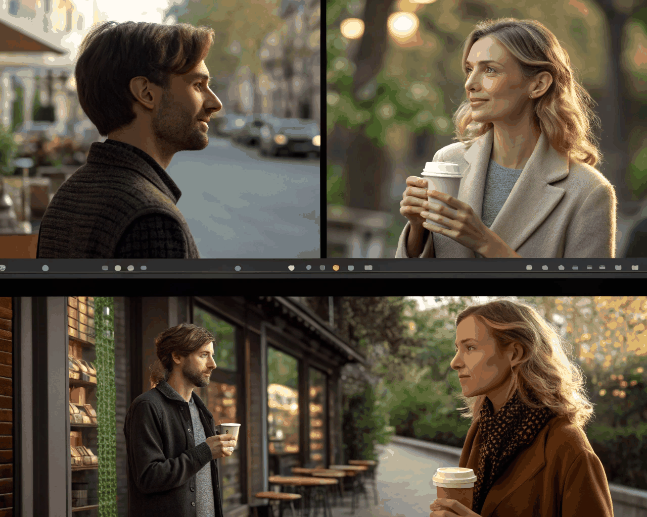
Abstract Data Visualization Video for Annual Reports
Category:
File format:
Style:
Delivery time:
Revisions:
I have translated spreadsheet data into animated visual stories for finance teams and corporate communications departments using AI-powered tools. An animated data visualization can make an annual report presentation memorable or clearly show growth trends on a website. You provide the key figures, the story you want to tell (like revenue growth, market expansion or sustainability metrics) and your brand colors.
I use AI tools like Runway ML, Synthesia, and specialized data visualization AI to generate initial animated chart sequences, morphing structures, and data-driven motion graphics. The AI helps create flowing shapes, evolving graphs, and abstract visual elements. Then I refine and composite everything in After Effects, ensuring accurate data representation, smooth animations, and brand consistency. I design a custom abstract visual language—think flowing shapes, evolving graphs and morphing structures—and animate the data flow.
The result is a 1-2 minute video that turns numbers into a narrative. You receive the final video in MP4, plus a version with a transparent background (ProRes 4444 MOV) so you can overlay it on any backdrop in your own presentation software. The style is inspired by the clarity of professional information design, but tailored to be uniquely yours. The AI tools streamline the initial animation generation, allowing me to focus on refining the data visualization, timing, and visual storytelling.
This process involves more back-and-forth to ensure absolute accuracy in how data is represented, which is why the timeline is longer. It is a service that suits publicly traded companies, large non-profits or any organization that needs to communicate complex performance data in an accessible and engaging way.
€550.00
AI Video Generation

AI Video Generation

AI Video Generation

AI Video Generation

AI Video Generation
AI Video Generation
AI Video Generation

AI Video Generation
AI Video Generation

AI Video Generation
I have translated spreadsheet data into animated visual stories for finance teams and corporate communications departments using AI-powered tools. An animated data visualization can make an annual report presentation memorable or clearly show growth trends on a website. You provide the key figures, the story you want to tell (like revenue growth, market expansion or sustainability metrics) and your brand colors.
I use AI tools like Runway ML, Synthesia, and specialized data visualization AI to generate initial animated chart sequences, morphing structures, and data-driven motion graphics. The AI helps create flowing shapes, evolving graphs, and abstract visual elements. Then I refine and composite everything in After Effects, ensuring accurate data representation, smooth animations, and brand consistency. I design a custom abstract visual language—think flowing shapes, evolving graphs and morphing structures—and animate the data flow.
The result is a 1-2 minute video that turns numbers into a narrative. You receive the final video in MP4, plus a version with a transparent background (ProRes 4444 MOV) so you can overlay it on any backdrop in your own presentation software. The style is inspired by the clarity of professional information design, but tailored to be uniquely yours. The AI tools streamline the initial animation generation, allowing me to focus on refining the data visualization, timing, and visual storytelling.
This process involves more back-and-forth to ensure absolute accuracy in how data is represented, which is why the timeline is longer. It is a service that suits publicly traded companies, large non-profits or any organization that needs to communicate complex performance data in an accessible and engaging way.