
Style Discovery
Personal Style Analysis & Recommendations Consultation
Style Discovery
Digital Product Style Audit & Interface Tone Recommendations
Category:
File format:
Style:
Delivery time:
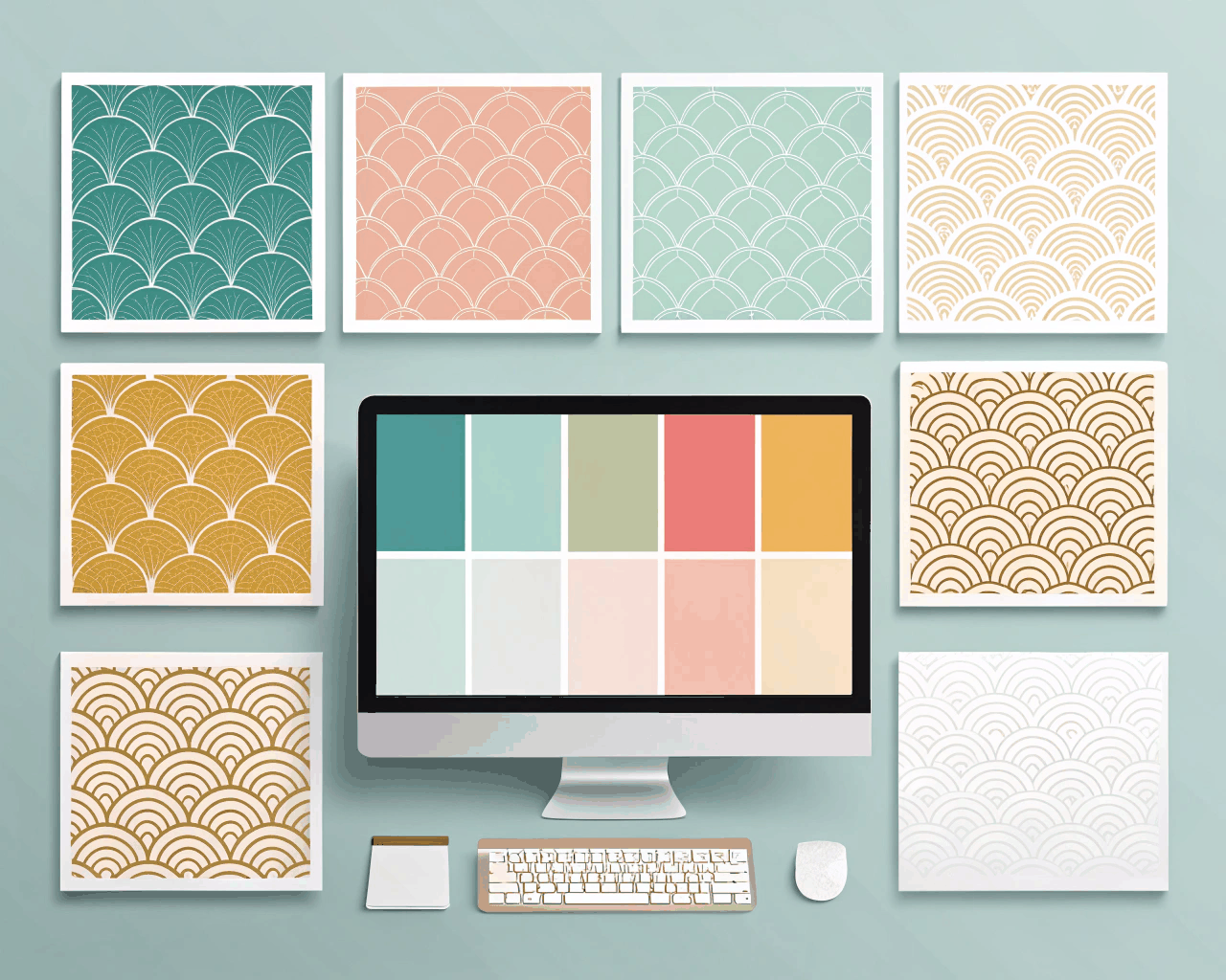
Your digital product’s interface has a tone of voice, and it’s communicated visually. A playful button here, a bold color there—but does it add up to a coherent experience? This consultation audits your app or website’s visual style and provides targeted recommendations for its interface tone. I analyze how modern UI patterns, playful micro-interactions and bold visual hierarchies work together to guide, engage and retain users.
The process delivers two key PDFs. The first is an audit findings report that screenshots and annotates your current interface, highlighting stylistic inconsistencies, accessibility issues and moments where the visual tone conflicts with user goals. The second is a UI tone document that defines the desired emotional impact of your interface. It translates abstract goals like ‘friendly’ or ‘powerful’ into specific visual recommendations for component design, animation curves, iconography style and data visualization.
This service is practical and actionable. The recommendations focus on how a playful style can reduce user anxiety during complex tasks. It advises on where bold color should be used for direction versus where it creates visual noise. The analysis considers how modern design trends apply to your specific user base and functionality. This isn’t about overhauling your UX. It’s about fine-tuning the visual layer to enhance usability, reinforce brand personality and improve user perception.
SaaS companies, mobile app developers and web-based platforms will find immediate value. The audit identifies quick wins to improve visual polish and the tone document provides a clear brief for your design team’s next sprint. You gain a shared vocabulary for discussing interface style, moving from subjective opinions (‘make it pop’) to objective strategy (‘use a bolder color here to increase the perceived affordance of this primary action’). The result is a digital product that feels not just functional but thoughtfully crafted.
€205.00
Style Discovery
Style Discovery
Style Discovery
Style Discovery
Style Discovery
Style Discovery

Style Discovery
Style Discovery

Style Discovery
Your digital product’s interface has a tone of voice, and it’s communicated visually. A playful button here, a bold color there—but does it add up to a coherent experience? This consultation audits your app or website’s visual style and provides targeted recommendations for its interface tone. I analyze how modern UI patterns, playful micro-interactions and bold visual hierarchies work together to guide, engage and retain users.
The process delivers two key PDFs. The first is an audit findings report that screenshots and annotates your current interface, highlighting stylistic inconsistencies, accessibility issues and moments where the visual tone conflicts with user goals. The second is a UI tone document that defines the desired emotional impact of your interface. It translates abstract goals like ‘friendly’ or ‘powerful’ into specific visual recommendations for component design, animation curves, iconography style and data visualization.
This service is practical and actionable. The recommendations focus on how a playful style can reduce user anxiety during complex tasks. It advises on where bold color should be used for direction versus where it creates visual noise. The analysis considers how modern design trends apply to your specific user base and functionality. This isn’t about overhauling your UX. It’s about fine-tuning the visual layer to enhance usability, reinforce brand personality and improve user perception.
SaaS companies, mobile app developers and web-based platforms will find immediate value. The audit identifies quick wins to improve visual polish and the tone document provides a clear brief for your design team’s next sprint. You gain a shared vocabulary for discussing interface style, moving from subjective opinions (‘make it pop’) to objective strategy (‘use a bolder color here to increase the perceived affordance of this primary action’). The result is a digital product that feels not just functional but thoughtfully crafted.