
Website UI Design System & Component Library for Startups
Category:
Website Design
File format:
Documentation, Figma Components
Style:
Modern & Data-Driven
Delivery time:
7+ days
Revisions:
3
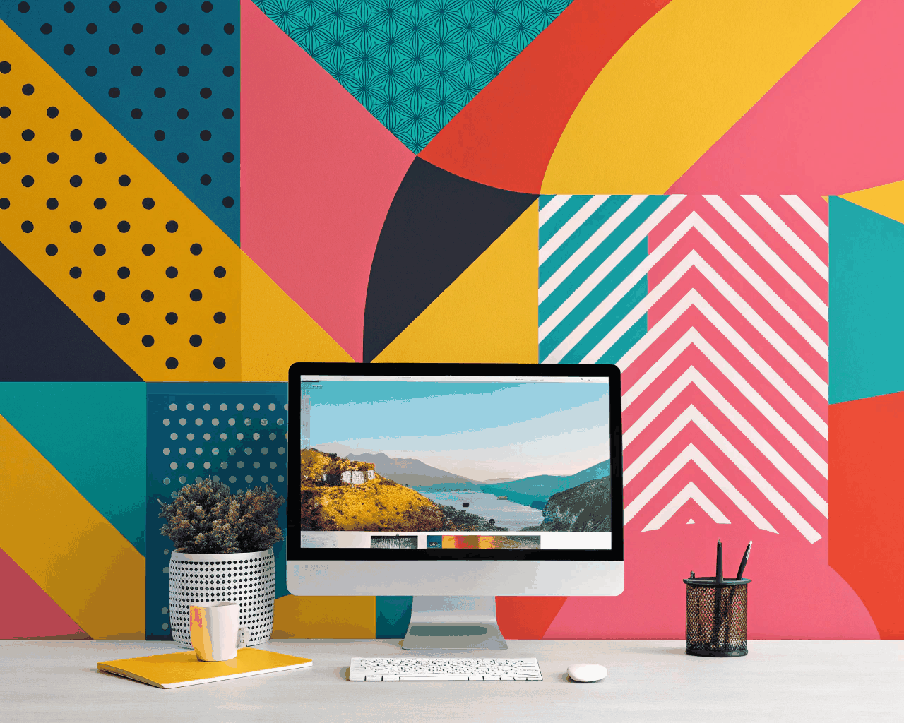
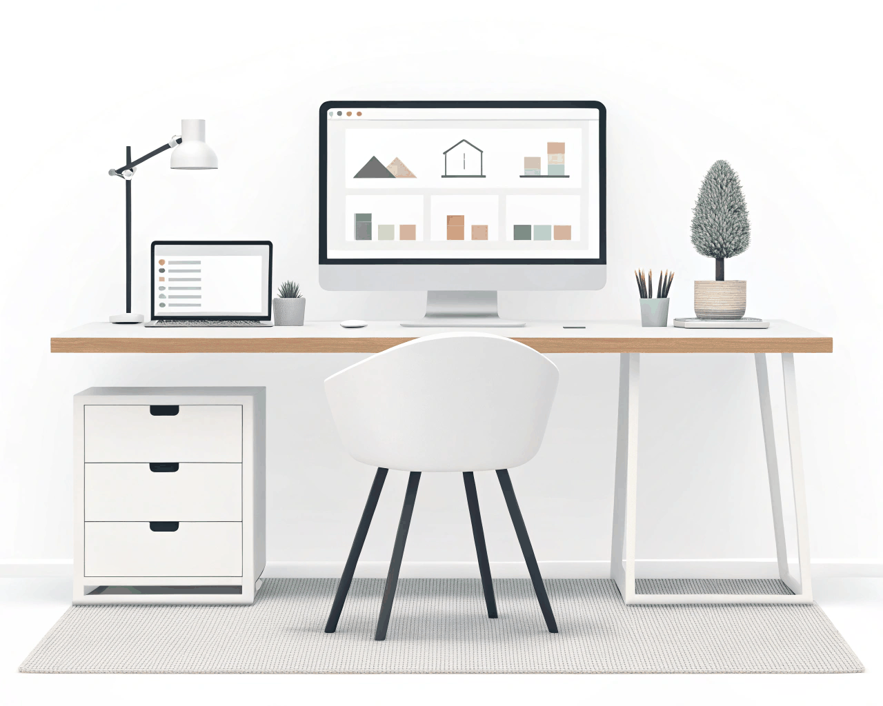
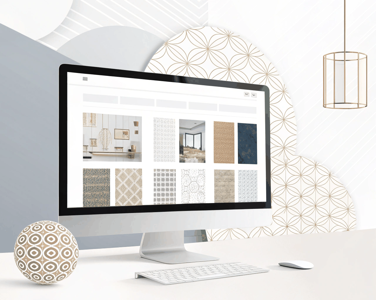
Scaling a startup’s product and marketing site consistently requires a shared design language. I build UI design systems in Figma that give your team a library of reusable components, from buttons and forms to complex data modules. This service creates the foundational visual rules and building blocks for your entire digital presence, ensuring consistency and speeding up future design work.
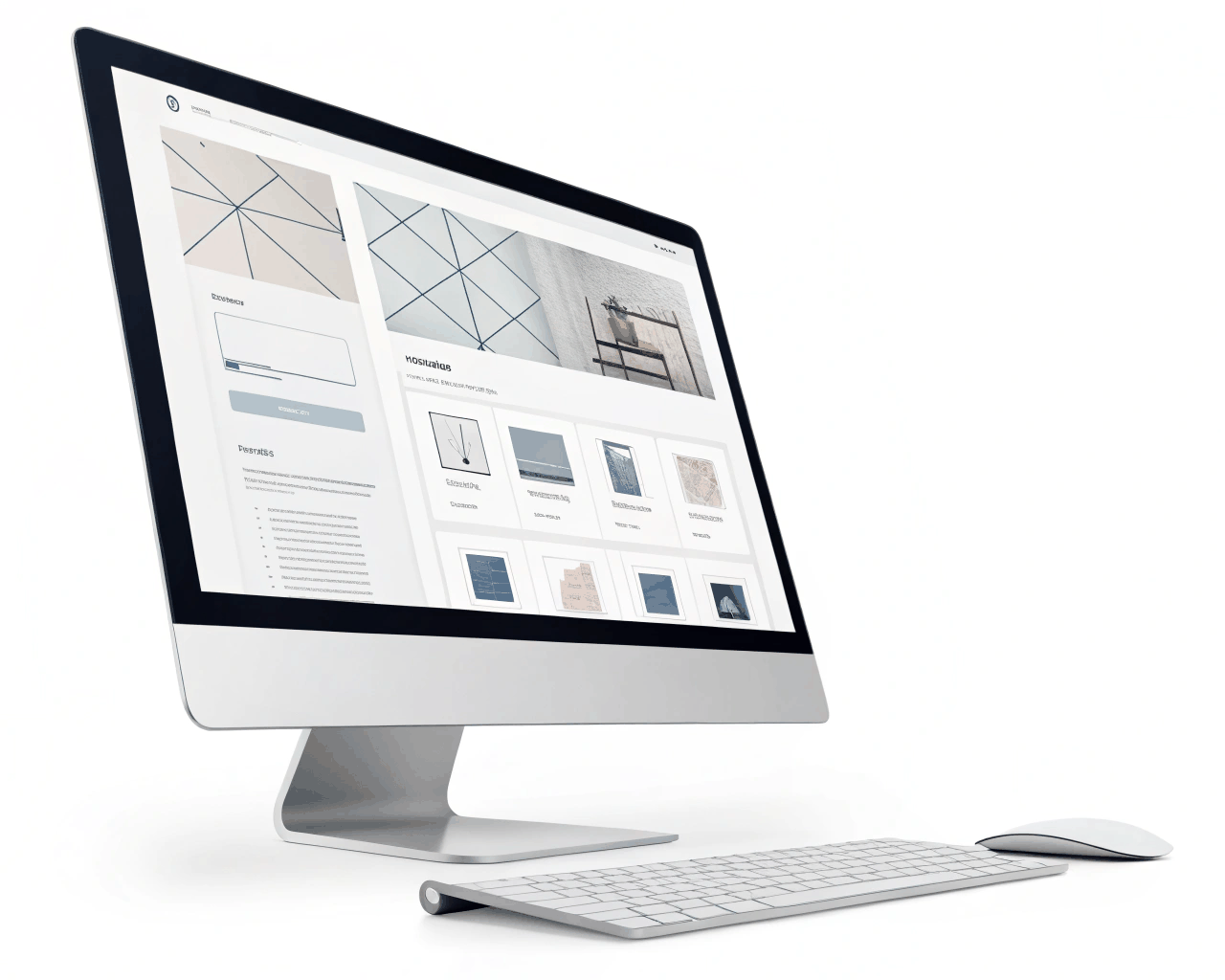
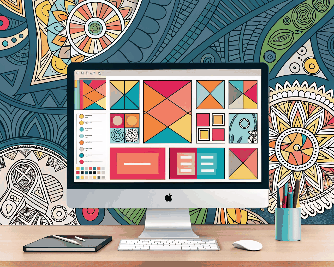
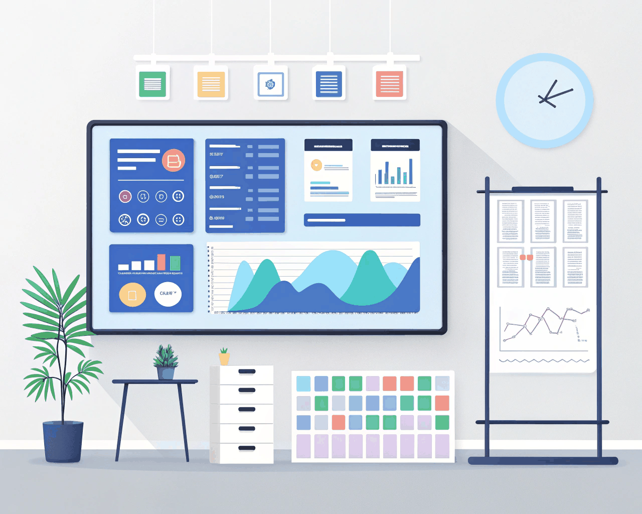
This package delivers a fully documented Figma design system file. It includes a defined color palette with primary, secondary and neutral shades, each with clear usage guidelines. You get a typography scale for headings, body text and UI labels. The core of the work is the component library: interactive buttons in various states, form fields, navigation bars, cards, modals, alerts and data display elements like tables and charts. Each component is built using Figma’s variant features, making them easy for your designers to swap and adjust. I also provide basic documentation on spacing, grid systems and iconography usage.
Investing in a system early saves significant time and prevents visual fragmentation. When every new page or feature is built from the same set of parts, the user experience feels cohesive and professional. It’s the same thinking behind Google’s Material Design or IBM’s Carbon Design System, just tailored to your brand’s specific scale and needs. Having worked with over twenty tech startups, I’ve seen how a good system empowers non-designers on the team to create coherent marketing materials and allows developers to build with confidence, knowing the specs are clear and centralized.
This service is ideal for funded startups or growing tech companies that have product-market fit and are now scaling their team. It’s for businesses that have outgrown their initial ad-hoc designs and need a systematic approach to maintain quality as they grow. The result is not just a set of files, but a shared resource that aligns your marketing, product and engineering teams around a single visual language, making your brand look considered and unified across every touchpoint.
€125.00
€182.00
Comments
Discover the similar products
Website Design
Modern E-commerce Product Page UX Design
Website Design

Website Design
Clean Conversion-Focused Landing Page for Service Businesses
Website Design
Website Design
Clean Corporate Website Design
Website Design
Website Design
Bold Artist Portfolio Website Design with Grid Layouts
Website Design
Website Design
Vintage Retro Homepage Design
Website Design
Website Design
SaaS Platform Dashboard UI with User Flow Mapping
Website Design
Website Design
Hand-drawn Illustrative Website Header Design
Website Design
Scaling a startup’s product and marketing site consistently requires a shared design language. I build UI design systems in Figma that give your team a library of reusable components, from buttons and forms to complex data modules. This service creates the foundational visual rules and building blocks for your entire digital presence, ensuring consistency and speeding up future design work.
This package delivers a fully documented Figma design system file. It includes a defined color palette with primary, secondary and neutral shades, each with clear usage guidelines. You get a typography scale for headings, body text and UI labels. The core of the work is the component library: interactive buttons in various states, form fields, navigation bars, cards, modals, alerts and data display elements like tables and charts. Each component is built using Figma’s variant features, making them easy for your designers to swap and adjust. I also provide basic documentation on spacing, grid systems and iconography usage.
Investing in a system early saves significant time and prevents visual fragmentation. When every new page or feature is built from the same set of parts, the user experience feels cohesive and professional. It’s the same thinking behind Google’s Material Design or IBM’s Carbon Design System, just tailored to your brand’s specific scale and needs. Having worked with over twenty tech startups, I’ve seen how a good system empowers non-designers on the team to create coherent marketing materials and allows developers to build with confidence, knowing the specs are clear and centralized.
This service is ideal for funded startups or growing tech companies that have product-market fit and are now scaling their team. It’s for businesses that have outgrown their initial ad-hoc designs and need a systematic approach to maintain quality as they grow. The result is not just a set of files, but a shared resource that aligns your marketing, product and engineering teams around a single visual language, making your brand look considered and unified across every touchpoint.