

Design Systems
Accessibility-First UI Component Library Audit & Build
Design Systems
Interactive Data Visualization Component Library
Category:
File format:
Style:
Delivery time:
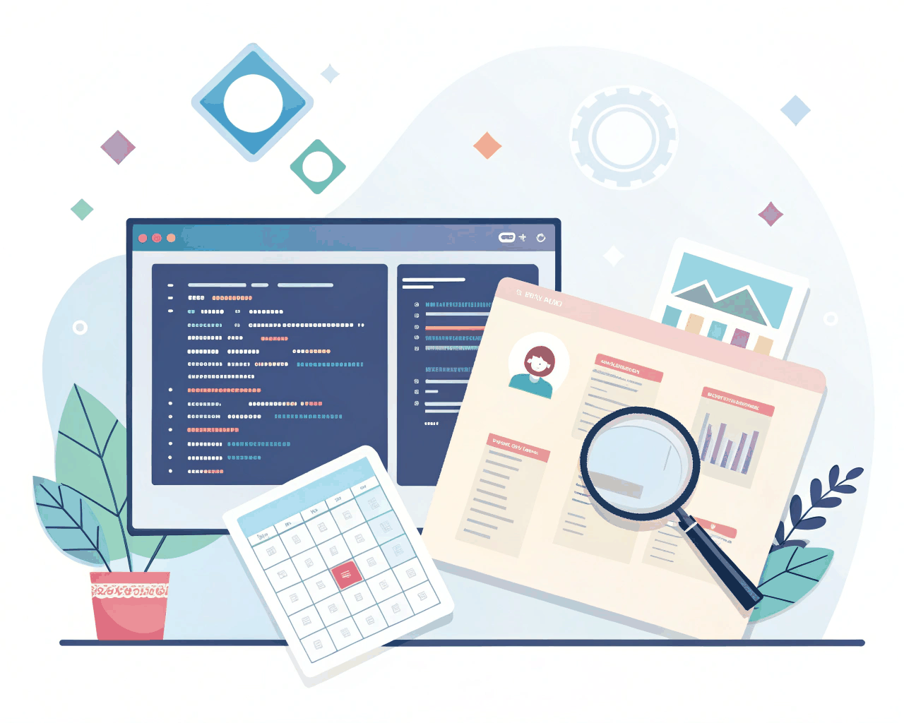
Charts and graphs often break design systems because they’re treated as one-off illustrations. I build a dedicated library of interactive data visualization components that integrate seamlessly with your core UI system. This ensures bar charts, line graphs, pie charts and complex dashboards feel like a native part of your product, with consistent styling and interaction patterns.
You receive a suite of Figma components for the most common chart types, each built with master elements for axes, data series, legends and tooltips. The components are structured to be adaptable—a bar chart can be reconfigured as a stacked or grouped bar without losing its style. I provide detailed specification documents for developers that map design properties to charting library options (like Chart.js or D3). The package includes example JSON data structures to demonstrate how real data flows into the components, ensuring the design handles both ideal and edge-case data scenarios.
I design with interactivity as a core requirement. This means defining hover states, click behaviors, zoom controls and how tooltips display information clearly. Accessibility is built in, with specifications for color-blind friendly palettes, patterns for monochrome rendering and text descriptions for screen readers. My work is grounded in data visualization principles, prioritizing clarity and honesty in how data is presented, avoiding common pitfalls like misleading axis scales or overloaded charts.
This library is built for products in analytics, finance, health tech or any domain where data storytelling is key. It helps internal teams present metrics to stakeholders and allows end-users to explore their own information. By systematizing charts, you ensure that a revenue graph in one part of your app and a user activity graph in another are built from the same parts, creating a trustworthy and professional user experience. The system scales from simple KPIs on a mobile screen to multi-dimensional business intelligence dashboards.
€369.00
Design Systems

Design Systems

Design Systems
Design Systems
Design Systems
Design Systems

Design Systems

Design Systems
Charts and graphs often break design systems because they’re treated as one-off illustrations. I build a dedicated library of interactive data visualization components that integrate seamlessly with your core UI system. This ensures bar charts, line graphs, pie charts and complex dashboards feel like a native part of your product, with consistent styling and interaction patterns.
You receive a suite of Figma components for the most common chart types, each built with master elements for axes, data series, legends and tooltips. The components are structured to be adaptable—a bar chart can be reconfigured as a stacked or grouped bar without losing its style. I provide detailed specification documents for developers that map design properties to charting library options (like Chart.js or D3). The package includes example JSON data structures to demonstrate how real data flows into the components, ensuring the design handles both ideal and edge-case data scenarios.
I design with interactivity as a core requirement. This means defining hover states, click behaviors, zoom controls and how tooltips display information clearly. Accessibility is built in, with specifications for color-blind friendly palettes, patterns for monochrome rendering and text descriptions for screen readers. My work is grounded in data visualization principles, prioritizing clarity and honesty in how data is presented, avoiding common pitfalls like misleading axis scales or overloaded charts.
This library is built for products in analytics, finance, health tech or any domain where data storytelling is key. It helps internal teams present metrics to stakeholders and allows end-users to explore their own information. By systematizing charts, you ensure that a revenue graph in one part of your app and a user activity graph in another are built from the same parts, creating a trustworthy and professional user experience. The system scales from simple KPIs on a mobile screen to multi-dimensional business intelligence dashboards.