
Modern SaaS Dashboard UI Design with Interactive Prototype
Category:
Website Design
File format:
Adobe XD, Figma, PDF, PNG
Style:
Modern
Delivery time:
3–5 days
Revisions:
3
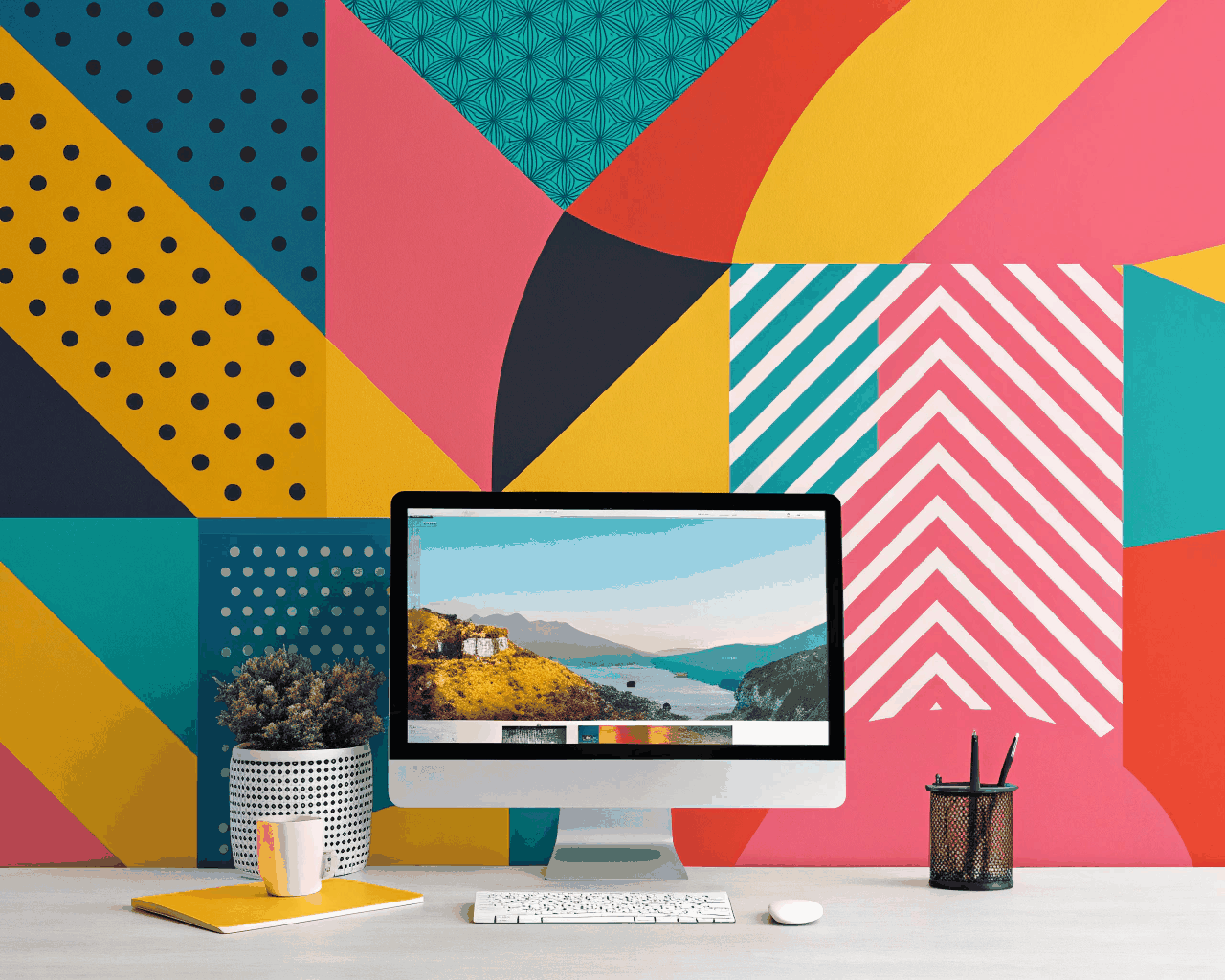
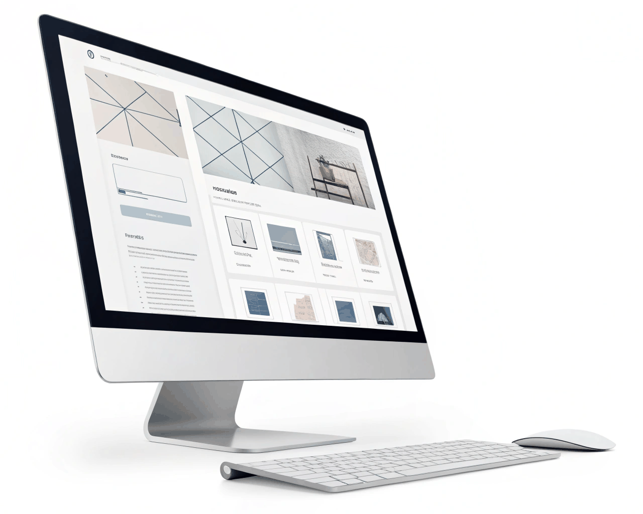
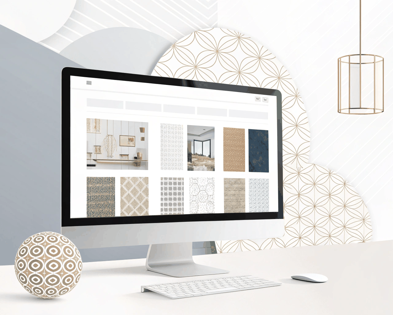
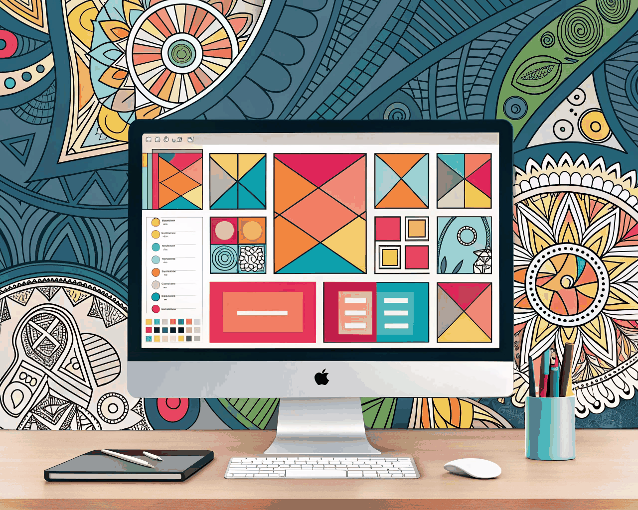
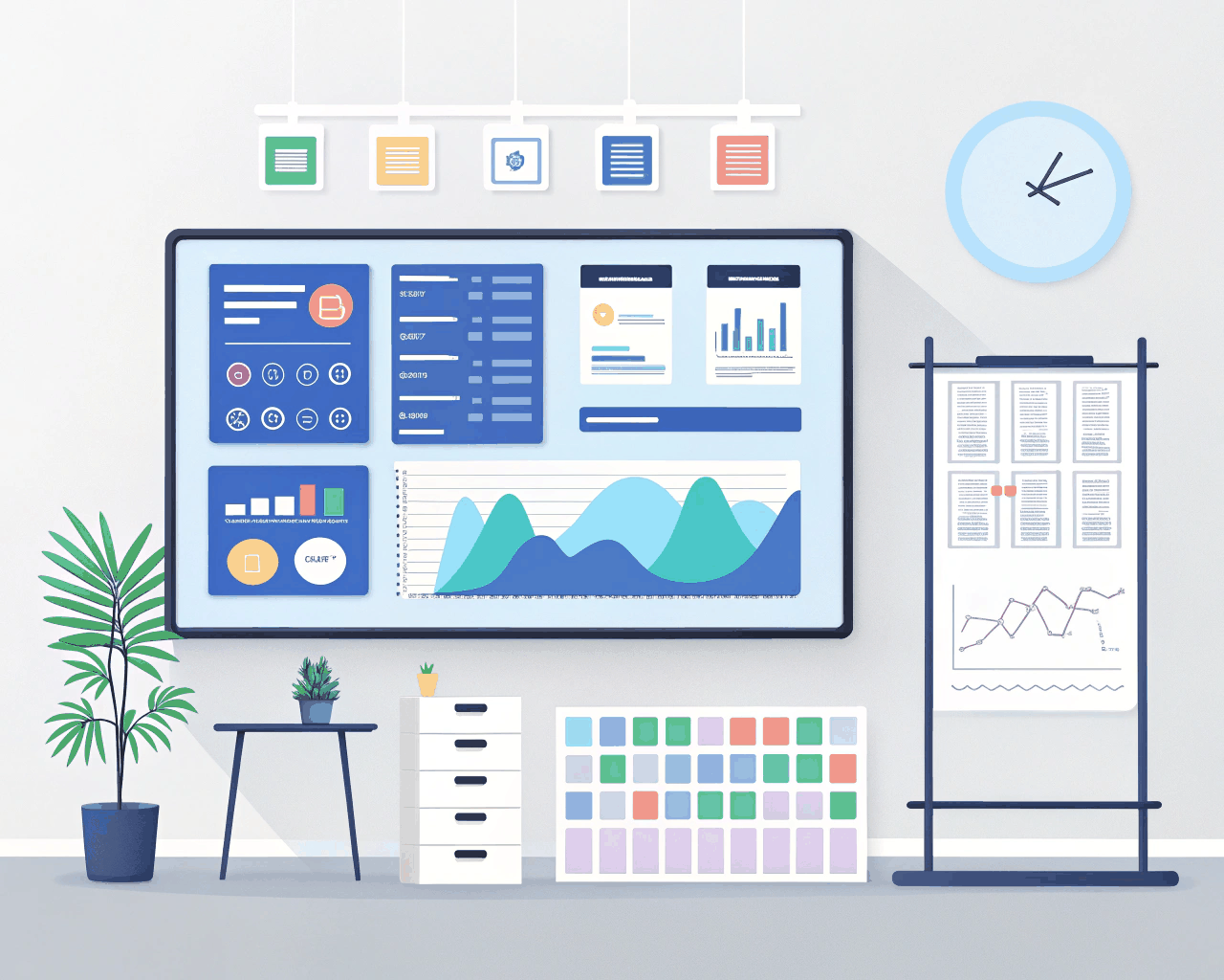
SaaS dashboards need to present complex data without overwhelming the user. I design clear, functional interfaces for web applications where usability is the priority. The focus is on creating a logical layout for metrics, charts and user controls that feels intuitive from the first login. This service is about more than aesthetics – it’s about building a tool people can use efficiently every day. You’ll receive a complete dashboard design covering the primary user screen, typically the analytics overview or project dashboard. This includes a style guide with your color palette, typography choices and a component library for buttons, form fields and data visualizations. The key deliverable is a clickable, interactive prototype built in Figma or Adobe XD. This lets you and your team navigate the main user flows, like filtering data or drilling down into reports, to test the logic before any code is written. I provide all source files and export critical assets as PNGs. A clean, structured dashboard builds trust. Users should feel in control, not confused by their own tools. I take inspiration from the straightforward utility of platforms like Stripe’s dashboard or the clarity of Google Analytics. My process involves mapping out the core tasks your users perform and ensuring the interface supports those actions with the fewest possible clicks. Over fifty B2B software projects have shown me that the best dashboard design often looks simple because the complex work happens behind the scenes. This service works for startups launching their first MVP and established companies redesigning an outdated admin panel. The goal is a design that scales with your feature set and remains easy for your team to maintain.
€49.00
Comments
Discover the similar products
Website Design
Modern E-commerce Product Page UX Design
Website Design

Website Design
Clean Conversion-Focused Landing Page for Service Businesses
Website Design

Website Design
Clean Corporate Website Design
Website Design
Website Design
Bold Artist Portfolio Website Design with Grid Layouts
Website Design
Website Design
Vintage Retro Homepage Design
Website Design
Website Design
SaaS Platform Dashboard UI with User Flow Mapping
Website Design

Website Design
Hand-drawn Illustrative Website Header Design
Website Design
SaaS dashboards need to present complex data without overwhelming the user. I design clear, functional interfaces for web applications where usability is the priority. The focus is on creating a logical layout for metrics, charts and user controls that feels intuitive from the first login. This service is about more than aesthetics – it’s about building a tool people can use efficiently every day. You’ll receive a complete dashboard design covering the primary user screen, typically the analytics overview or project dashboard. This includes a style guide with your color palette, typography choices and a component library for buttons, form fields and data visualizations. The key deliverable is a clickable, interactive prototype built in Figma or Adobe XD. This lets you and your team navigate the main user flows, like filtering data or drilling down into reports, to test the logic before any code is written. I provide all source files and export critical assets as PNGs. A clean, structured dashboard builds trust. Users should feel in control, not confused by their own tools. I take inspiration from the straightforward utility of platforms like Stripe’s dashboard or the clarity of Google Analytics. My process involves mapping out the core tasks your users perform and ensuring the interface supports those actions with the fewest possible clicks. Over fifty B2B software projects have shown me that the best dashboard design often looks simple because the complex work happens behind the scenes. This service works for startups launching their first MVP and established companies redesigning an outdated admin panel. The goal is a design that scales with your feature set and remains easy for your team to maintain.