
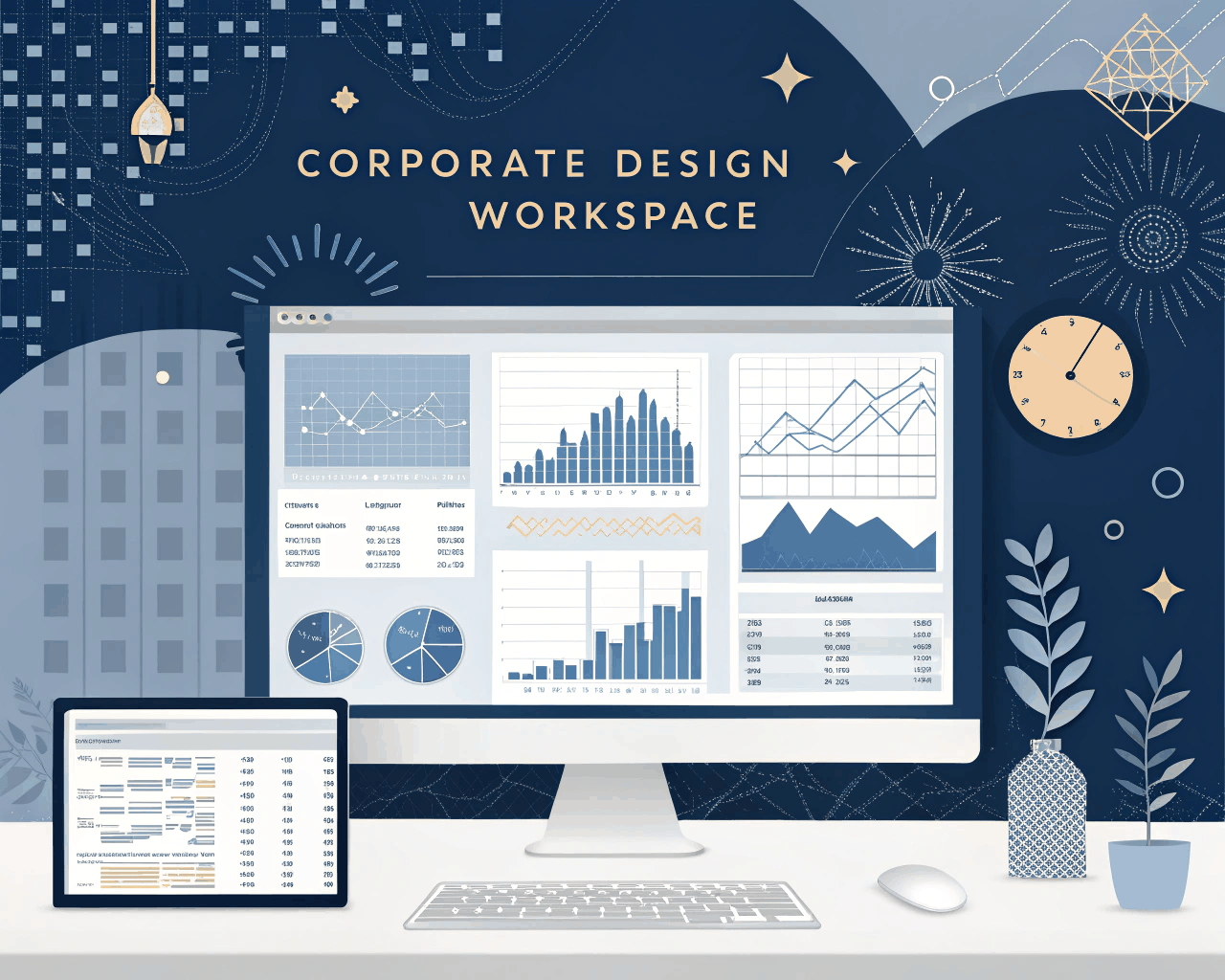
Annual Report Data Visualization for Finance Teams
Category:
Infographics
File format:
Editable AI, High-Res JPG, InDesign Package, PDF
Style:
Corporate
Delivery time:
7+ days
Revisions:
1
Annual reports and corporate sustainability pages demand more than a PDF. An interactive infographic turns your key metrics into an explorable experience, increasing engagement and time spent on page. This service delivers a custom-coded, web-ready interactive data visualization that works seamlessly on desktop and mobile devices.
Deliverables are comprehensive and built for integration. You get clean, documented HTML5 and JavaScript files that form the core interactive module. All graphical elements are provided as scalable SVG assets for crisp display at any resolution. A full set of static PNG fallback images is also created for email summaries or platforms that don’t support interactivity. I build with lightweight libraries to ensure fast load times and smooth hover or click animations. The interactive features can include toggleable data layers, animated charts that build on scroll and clickable hotspots that reveal deeper insights.
This solution serves large corporations, financial institutions and NGOs that publish detailed annual or ESG reports. The interactivity allows stakeholders to engage with the data that matters most to them, personalizing their journey through your performance story. The design is corporate and authoritative yet intuitive, using color and typography to establish hierarchy and guide interaction.
You receive two complete visual concepts for the interactive layout. The package includes four change requests during the development phase to adjust data representations, interaction triggers and styling. The process involves an initial technical consultation to define the scope of interactivity, followed by wireframing, visual design and finally, development and testing. All code is structured for easy handoff to your web team.
€200.00
€386.00
Comments
Discover the similar products


Infographics
Interactive Infographic Prototype for Web Deployment
Infographics
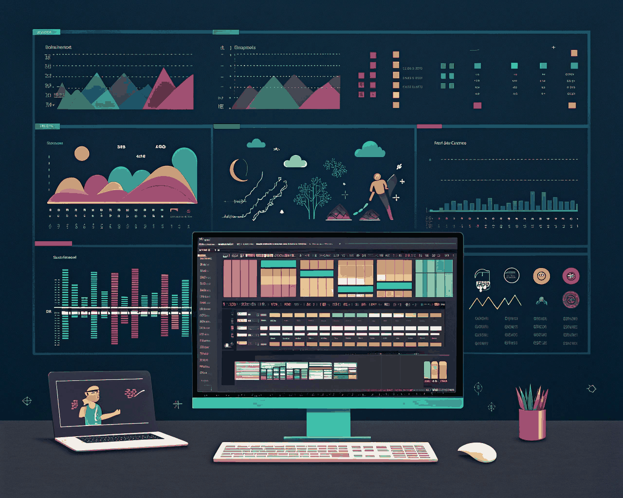


Annual reports and corporate sustainability pages demand more than a PDF. An interactive infographic turns your key metrics into an explorable experience, increasing engagement and time spent on page. This service delivers a custom-coded, web-ready interactive data visualization that works seamlessly on desktop and mobile devices.
Deliverables are comprehensive and built for integration. You get clean, documented HTML5 and JavaScript files that form the core interactive module. All graphical elements are provided as scalable SVG assets for crisp display at any resolution. A full set of static PNG fallback images is also created for email summaries or platforms that don’t support interactivity. I build with lightweight libraries to ensure fast load times and smooth hover or click animations. The interactive features can include toggleable data layers, animated charts that build on scroll and clickable hotspots that reveal deeper insights.
This solution serves large corporations, financial institutions and NGOs that publish detailed annual or ESG reports. The interactivity allows stakeholders to engage with the data that matters most to them, personalizing their journey through your performance story. The design is corporate and authoritative yet intuitive, using color and typography to establish hierarchy and guide interaction.
You receive two complete visual concepts for the interactive layout. The package includes four change requests during the development phase to adjust data representations, interaction triggers and styling. The process involves an initial technical consultation to define the scope of interactivity, followed by wireframing, visual design and finally, development and testing. All code is structured for easy handoff to your web team.