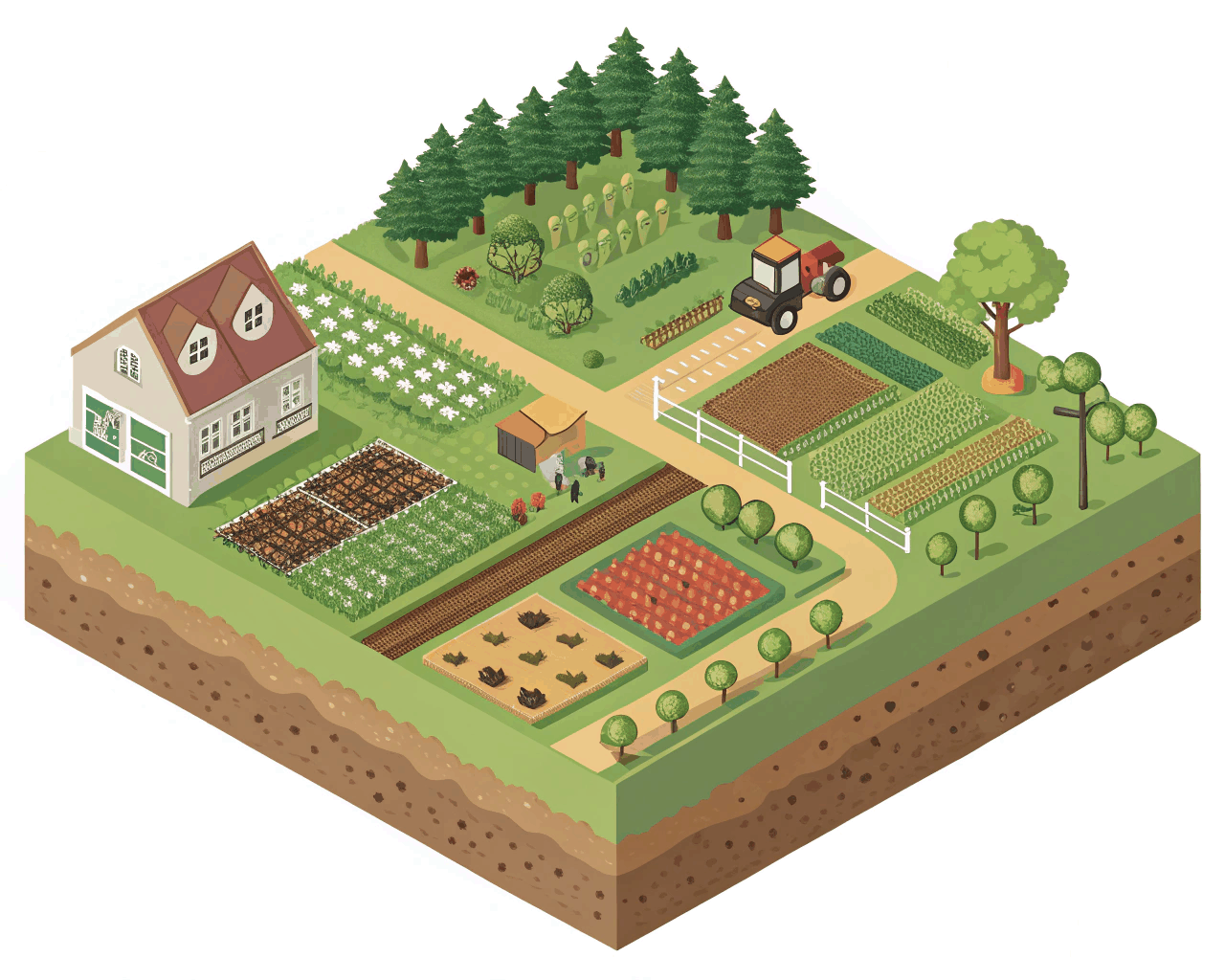

Isometric Art
Playful Isometric Onboarding Sequence for Mobile Apps
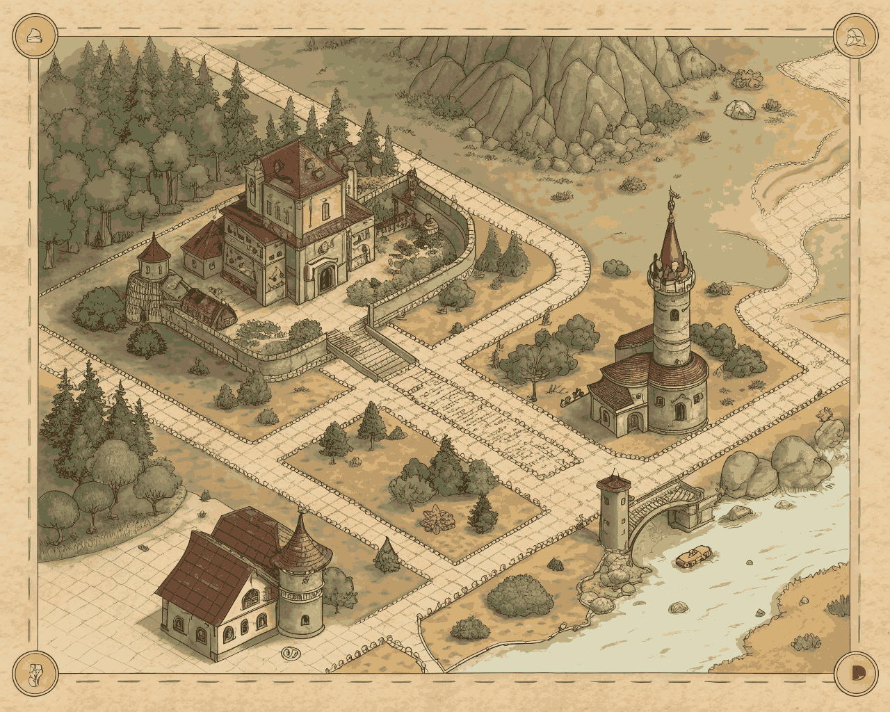
Isometric Art
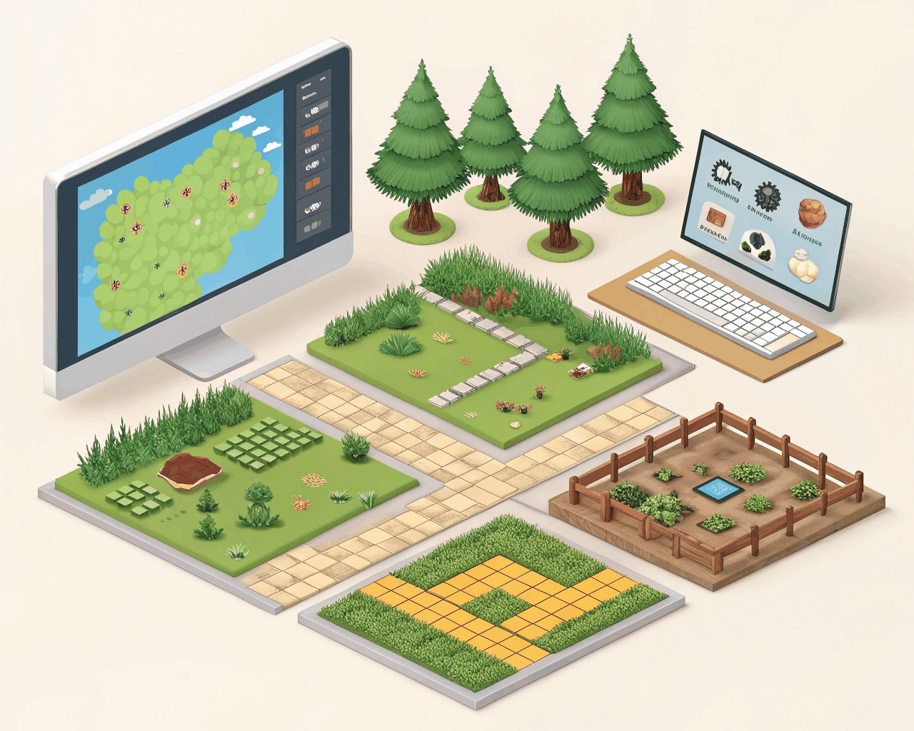
Isometric Tech Dashboard Illustration for SaaS Platforms
Category:
File format:
Style:
Delivery time:
Revisions:
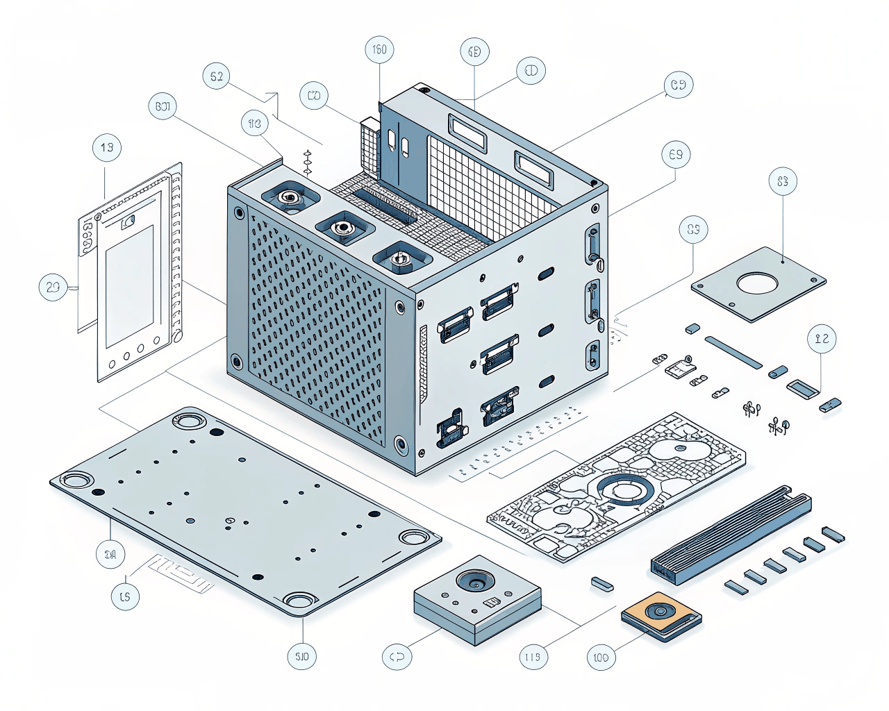
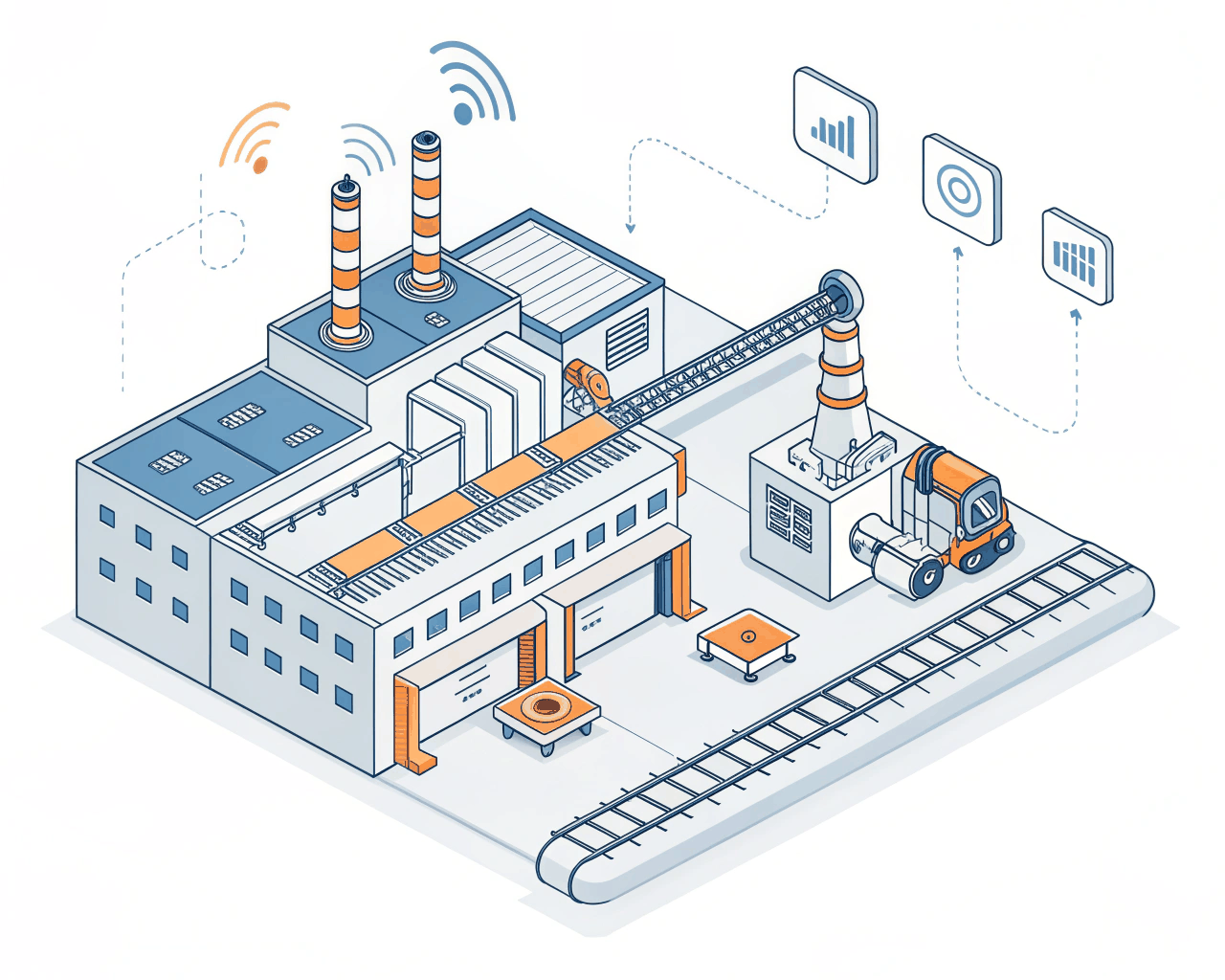
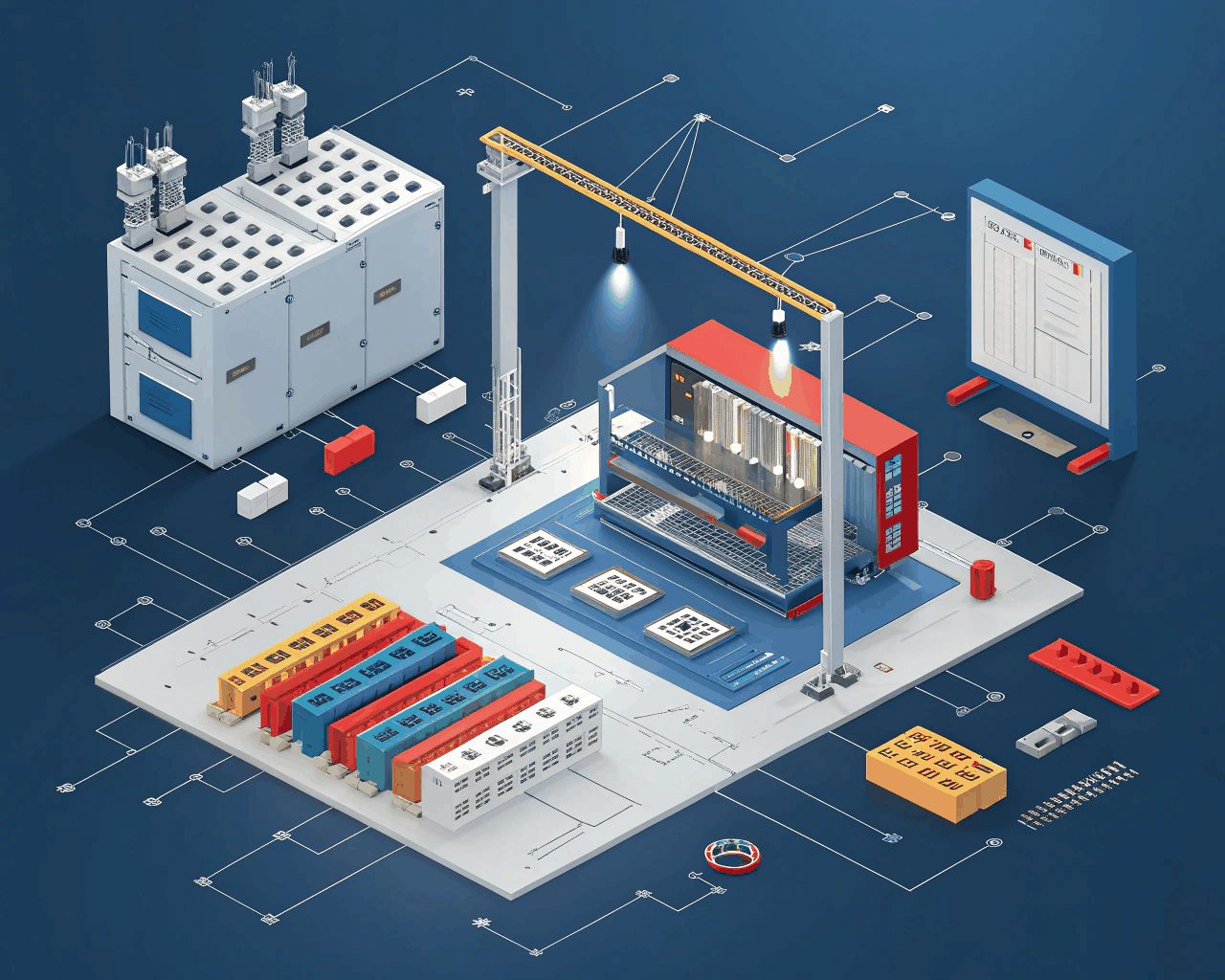
SaaS companies and tech startups need clear visuals to explain complex features, and isometric dashboards make abstract data feel tangible and interactive. I illustrate detailed control panels, data streams and user interfaces in a clean isometric style that integrates seamlessly into your website or app onboarding. This service focuses on creating a single, comprehensive scene that tells the story of your platform’s core functionality.
You receive one fully realized isometric dashboard illustration. The process begins with a discussion about your key metrics or user actions, which I then translate into a cohesive scene with monitors, graphs, notifications and user avatars. I provide two initial sketch concepts for the layout and composition. Once you choose a direction, I move into full color rendering with a palette that matches your brand. The final delivery includes high-resolution PNG files with a transparent background ready for web use, scalable SVG vectors, editable Adobe Illustrator source files and an FBX format for potential lightweight animation or integration into video presentations.
This style works because it breaks down information overload. Instead of listing features, you can show a customer interacting with them. I take cues from the clarity of platforms like Stripe’s documentation or HubSpot’s educational content, where isometric art is used to demystify processes. The angled perspective allows me to layer information in a way a flat icon can’t, showing cause and effect within your system.
I’ve created these explanatory illustrations for over thirty B2B software companies. The goal is always utility first—creating an asset your marketing and product teams can use across decks, help centers and blog posts for years. It’s particularly useful for startups preparing a launch or established companies redesigning their help documentation to improve user comprehension.
€70.00
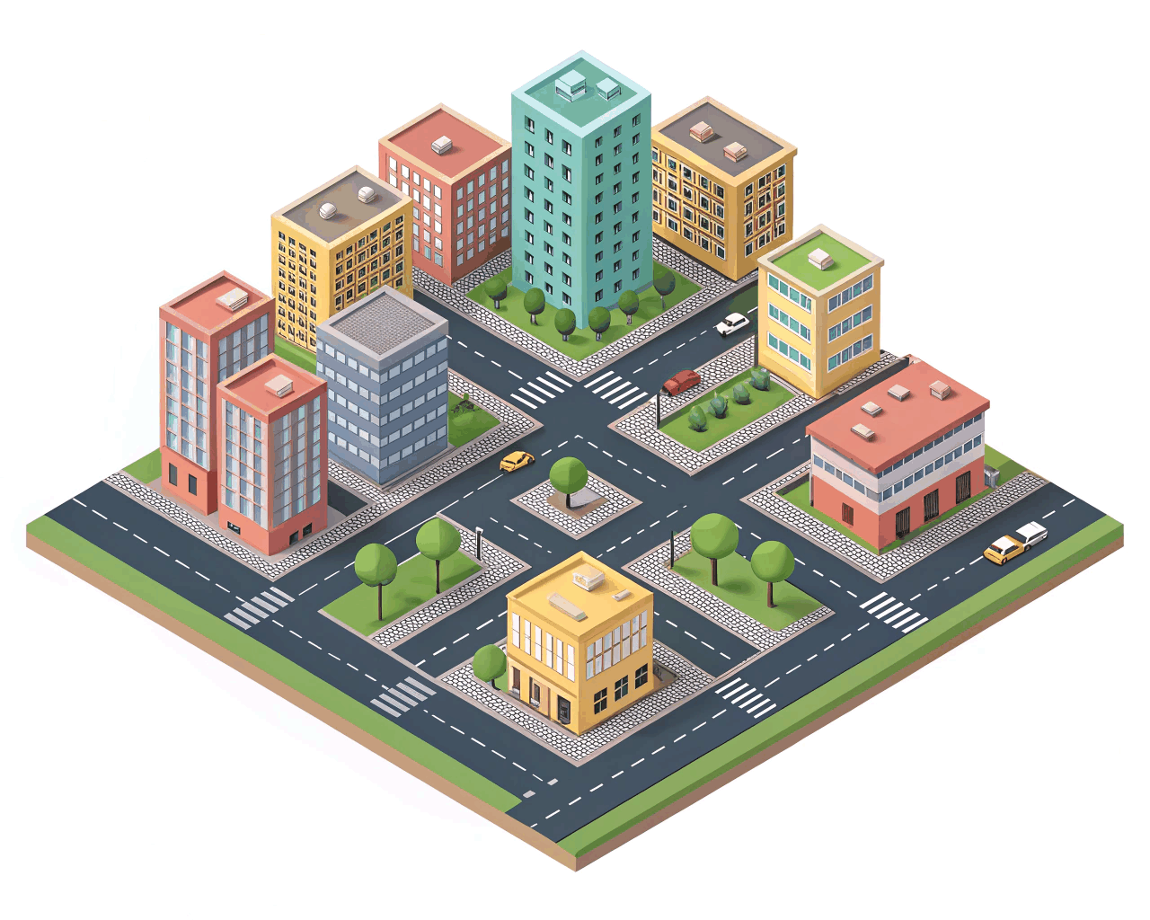
Isometric Art
Isometric Art
Isometric Art

Isometric Art
Isometric Art
SaaS companies and tech startups need clear visuals to explain complex features, and isometric dashboards make abstract data feel tangible and interactive. I illustrate detailed control panels, data streams and user interfaces in a clean isometric style that integrates seamlessly into your website or app onboarding. This service focuses on creating a single, comprehensive scene that tells the story of your platform’s core functionality.
You receive one fully realized isometric dashboard illustration. The process begins with a discussion about your key metrics or user actions, which I then translate into a cohesive scene with monitors, graphs, notifications and user avatars. I provide two initial sketch concepts for the layout and composition. Once you choose a direction, I move into full color rendering with a palette that matches your brand. The final delivery includes high-resolution PNG files with a transparent background ready for web use, scalable SVG vectors, editable Adobe Illustrator source files and an FBX format for potential lightweight animation or integration into video presentations.
This style works because it breaks down information overload. Instead of listing features, you can show a customer interacting with them. I take cues from the clarity of platforms like Stripe’s documentation or HubSpot’s educational content, where isometric art is used to demystify processes. The angled perspective allows me to layer information in a way a flat icon can’t, showing cause and effect within your system.
I’ve created these explanatory illustrations for over thirty B2B software companies. The goal is always utility first—creating an asset your marketing and product teams can use across decks, help centers and blog posts for years. It’s particularly useful for startups preparing a launch or established companies redesigning their help documentation to improve user comprehension.